plt.hist is a powerful function in Matplotlib that allows you to create histograms, which are essential tools for data visualization and analysis. This comprehensive guide will explore the various aspects of plt.hist, providing detailed explanations and practical examples to help you master histogram creation in Matplotlib.
plt.hist Recommended Articles
Introduction to plt.hist
plt.hist is a versatile function in Matplotlib that enables users to create histograms, which are graphical representations of the distribution of numerical data. Histograms are particularly useful for visualizing the frequency or probability distribution of a dataset, making them invaluable in fields such as statistics, data science, and scientific research.
The basic syntax of plt.hist is as follows:
import matplotlib.pyplot as plt
import numpy as np
data = np.random.randn(1000)
plt.hist(data)
plt.title('Histogram Example - how2matplotlib.com')
plt.xlabel('Value')
plt.ylabel('Frequency')
plt.show()
Output:
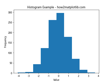
In this example, we generate random data using NumPy and create a simple histogram using plt.hist. The function automatically calculates the bin edges and frequencies, providing a quick overview of the data distribution.
Understanding the Parameters of plt.hist
plt.hist offers a wide range of parameters that allow you to customize your histograms. Let’s explore some of the most important ones:
1. x (array-like)
The ‘x’ parameter is the input data for which the histogram will be computed. It can be a single array or a list of arrays.
import matplotlib.pyplot as plt
import numpy as np
data1 = np.random.normal(0, 1, 1000)
data2 = np.random.normal(2, 1.5, 1000)
plt.hist([data1, data2], label=['Data 1', 'Data 2'])
plt.title('Multiple Datasets Histogram - how2matplotlib.com')
plt.legend()
plt.show()
Output:
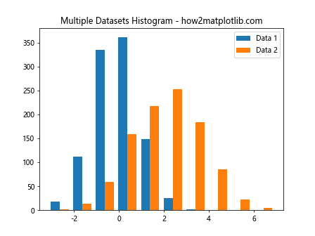
This example demonstrates how to create a histogram with multiple datasets using plt.hist.
2. bins (int or sequence)
The ‘bins’ parameter determines the number of equal-width bins in the histogram or the bin edges.
import matplotlib.pyplot as plt
import numpy as np
data = np.random.randn(1000)
plt.hist(data, bins=30)
plt.title('Histogram with Custom Bins - how2matplotlib.com')
plt.xlabel('Value')
plt.ylabel('Frequency')
plt.show()
Output:
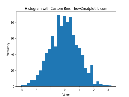
This example shows how to specify a custom number of bins for the histogram.
3. range (tuple)
The ‘range’ parameter allows you to specify the lower and upper range of the bins.
import matplotlib.pyplot as plt
import numpy as np
data = np.random.randn(1000)
plt.hist(data, range=(-3, 3))
plt.title('Histogram with Custom Range - how2matplotlib.com')
plt.xlabel('Value')
plt.ylabel('Frequency')
plt.show()
Output:
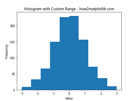
This example demonstrates how to set a custom range for the histogram bins.
4. density (bool)
When set to True, the ‘density’ parameter normalizes the histogram so that the integral of the histogram equals 1.
import matplotlib.pyplot as plt
import numpy as np
data = np.random.randn(1000)
plt.hist(data, density=True)
plt.title('Normalized Histogram - how2matplotlib.com')
plt.xlabel('Value')
plt.ylabel('Probability Density')
plt.show()
Output:
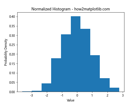
This example shows how to create a normalized histogram using plt.hist.
5. cumulative (bool)
The ‘cumulative’ parameter, when set to True, creates a cumulative histogram.
import matplotlib.pyplot as plt
import numpy as np
data = np.random.randn(1000)
plt.hist(data, cumulative=True)
plt.title('Cumulative Histogram - how2matplotlib.com')
plt.xlabel('Value')
plt.ylabel('Cumulative Frequency')
plt.show()
Output:
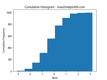
This example demonstrates how to create a cumulative histogram using plt.hist.
Advanced Customization with plt.hist
plt.hist offers numerous options for customizing the appearance and behavior of histograms. Let’s explore some advanced techniques:
1. Stacked Histograms
You can create stacked histograms to compare multiple datasets:
import matplotlib.pyplot as plt
import numpy as np
data1 = np.random.normal(0, 1, 1000)
data2 = np.random.normal(2, 1, 1000)
plt.hist([data1, data2], stacked=True, label=['Data 1', 'Data 2'])
plt.title('Stacked Histogram - how2matplotlib.com')
plt.legend()
plt.show()
Output:
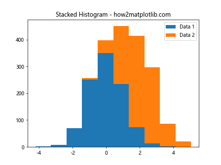
This example demonstrates how to create a stacked histogram using plt.hist.
2. Step Histograms
Step histograms can be created by setting the ‘histtype’ parameter to ‘step’:
import matplotlib.pyplot as plt
import numpy as np
data = np.random.randn(1000)
plt.hist(data, histtype='step')
plt.title('Step Histogram - how2matplotlib.com')
plt.xlabel('Value')
plt.ylabel('Frequency')
plt.show()
Output:
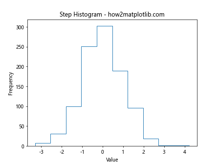
This example shows how to create a step histogram using plt.hist.
3. Custom Colors and Styles
You can customize the colors and styles of your histograms:
import matplotlib.pyplot as plt
import numpy as np
data = np.random.randn(1000)
plt.hist(data, color='skyblue', edgecolor='black', linewidth=1.2)
plt.title('Customized Histogram - how2matplotlib.com')
plt.xlabel('Value')
plt.ylabel('Frequency')
plt.show()
Output:
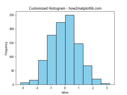
This example demonstrates how to customize the color and style of a histogram using plt.hist.
4. Logarithmic Scale
You can use a logarithmic scale for the y-axis:
import matplotlib.pyplot as plt
import numpy as np
data = np.random.lognormal(0, 1, 1000)
plt.hist(data)
plt.yscale('log')
plt.title('Histogram with Logarithmic Y-axis - how2matplotlib.com')
plt.xlabel('Value')
plt.ylabel('Log Frequency')
plt.show()
Output:
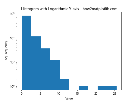
This example shows how to create a histogram with a logarithmic y-axis using plt.hist.
Comparing Distributions with plt.hist
plt.hist is an excellent tool for comparing different distributions. Let’s explore some techniques:
1. Overlapping Histograms
You can create overlapping histograms to compare distributions:
import matplotlib.pyplot as plt
import numpy as np
data1 = np.random.normal(0, 1, 1000)
data2 = np.random.normal(2, 1.5, 1000)
plt.hist(data1, alpha=0.5, label='Data 1')
plt.hist(data2, alpha=0.5, label='Data 2')
plt.title('Overlapping Histograms - how2matplotlib.com')
plt.legend()
plt.show()
Output:
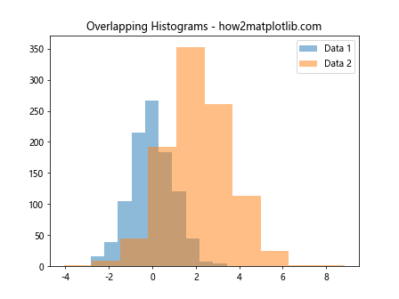
This example demonstrates how to create overlapping histograms using plt.hist.
2. Side-by-Side Histograms
You can create side-by-side histograms for easy comparison:
import matplotlib.pyplot as plt
import numpy as np
data1 = np.random.normal(0, 1, 1000)
data2 = np.random.normal(2, 1.5, 1000)
plt.hist([data1, data2], label=['Data 1', 'Data 2'])
plt.title('Side-by-Side Histograms - how2matplotlib.com')
plt.legend()
plt.show()
Output:
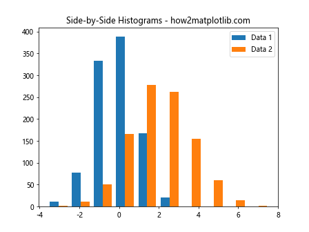
This example shows how to create side-by-side histograms using plt.hist.
3. Normalized Histograms for Comparison
Normalized histograms are useful for comparing distributions with different sample sizes:
import matplotlib.pyplot as plt
import numpy as np
data1 = np.random.normal(0, 1, 1000)
data2 = np.random.normal(2, 1.5, 2000)
plt.hist([data1, data2], density=True, label=['Data 1', 'Data 2'])
plt.title('Normalized Histograms for Comparison - how2matplotlib.com')
plt.legend()
plt.show()
Output:
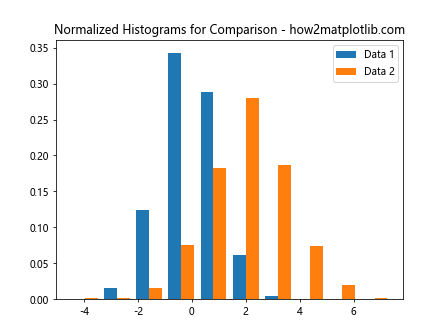
This example demonstrates how to create normalized histograms for comparison using plt.hist.
Analyzing Data with plt.hist
plt.hist is not just for visualization; it’s also a powerful tool for data analysis. Let’s explore some analytical techniques:
1. Identifying Outliers
Histograms can help identify outliers in your data:
import matplotlib.pyplot as plt
import numpy as np
data = np.concatenate([np.random.normal(0, 1, 990), np.random.uniform(5, 10, 10)])
plt.hist(data, bins=50)
plt.title('Histogram for Outlier Detection - how2matplotlib.com')
plt.xlabel('Value')
plt.ylabel('Frequency')
plt.show()
Output:
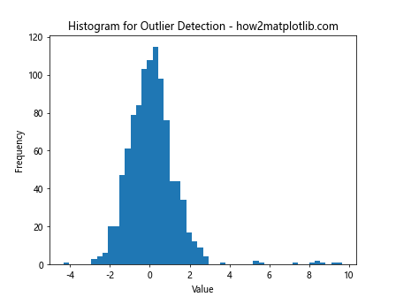
This example shows how to use plt.hist to identify outliers in a dataset.
2. Assessing Normality
Histograms can help assess whether data follows a normal distribution:
import matplotlib.pyplot as plt
import numpy as np
data = np.random.normal(0, 1, 1000)
plt.hist(data, bins=30, density=True)
x = np.linspace(-4, 4, 100)
plt.plot(x, 1/(np.sqrt(2*np.pi)) * np.exp(-x**2/2), linewidth=2)
plt.title('Assessing Normality with Histogram - how2matplotlib.com')
plt.xlabel('Value')
plt.ylabel('Probability Density')
plt.show()
Output:
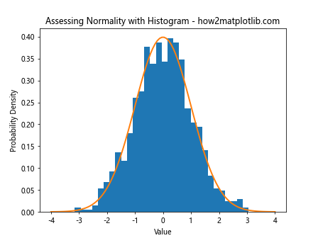
This example demonstrates how to use plt.hist to assess the normality of a dataset.
3. Comparing Empirical and Theoretical Distributions
You can use plt.hist to compare empirical data with theoretical distributions:
import matplotlib.pyplot as plt
import numpy as np
from scipy import stats
data = np.random.exponential(2, 1000)
plt.hist(data, bins=30, density=True, alpha=0.7, label='Empirical')
x = np.linspace(0, 15, 100)
plt.plot(x, stats.expon.pdf(x, scale=2), 'r-', lw=2, label='Theoretical')
plt.title('Empirical vs Theoretical Distribution - how2matplotlib.com')
plt.legend()
plt.show()
Output:
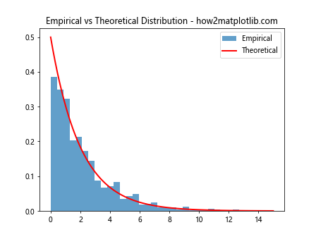
This example shows how to compare an empirical distribution with a theoretical distribution using plt.hist.
Advanced Techniques with plt.hist
Let’s explore some advanced techniques using plt.hist:
1. 2D Histograms
You can create 2D histograms to visualize the relationship between two variables:
import matplotlib.pyplot as plt
import numpy as np
x = np.random.normal(0, 1, 1000)
y = np.random.normal(0, 1, 1000)
plt.hist2d(x, y, bins=30)
plt.colorbar()
plt.title('2D Histogram - how2matplotlib.com')
plt.xlabel('X')
plt.ylabel('Y')
plt.show()
Output:
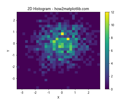
This example demonstrates how to create a 2D histogram using plt.hist2d.
2. Hexbin Plots
Hexbin plots are an alternative to 2D histograms for large datasets:
import matplotlib.pyplot as plt
import numpy as np
x = np.random.normal(0, 1, 10000)
y = np.random.normal(0, 1, 10000)
plt.hexbin(x, y, gridsize=20)
plt.colorbar()
plt.title('Hexbin Plot - how2matplotlib.com')
plt.xlabel('X')
plt.ylabel('Y')
plt.show()
Output:
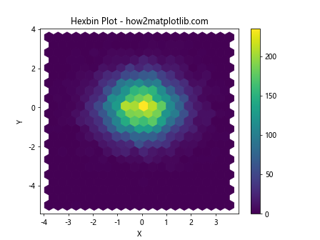
This example shows how to create a hexbin plot using plt.hexbin.
3. Kernel Density Estimation
You can combine histograms with kernel density estimation for a more detailed view of the data distribution:
import matplotlib.pyplot as plt
import numpy as np
from scipy import stats
data = np.random.normal(0, 1, 1000)
plt.hist(data, bins=30, density=True, alpha=0.7)
kde = stats.gaussian_kde(data)
x = np.linspace(-4, 4, 100)
plt.plot(x, kde(x), 'r-', lw=2)
plt.title('Histogram with KDE - how2matplotlib.com')
plt.xlabel('Value')
plt.ylabel('Density')
plt.show()
Output:
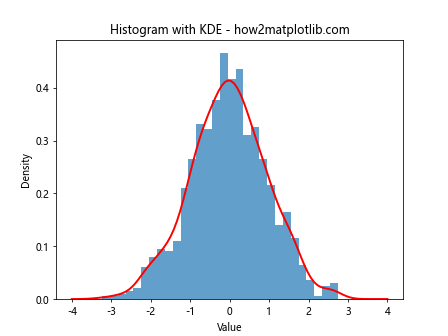
This example demonstrates how to combine a histogram with kernel density estimation using plt.hist and scipy.stats.
Best Practices for Using plt.hist
When working with plt.hist, it’s important to follow some best practices to ensure your histograms are informative and easy to interpret:
- Choose an appropriate number of bins: Too few bins can obscure important details, while too many can create noise. Experiment with different bin numbers to find the right balance.
- Use meaningful labels: Always include clear and descriptive titles, x-labels, and y-labels to provide context for your histogram.
- Consider normalization: When comparing datasets of different sizes, use the ‘density’ parameter to normalize your histograms.
- Use color effectively: Choose colors that are easy to distinguish and consider using alpha values for overlapping histograms.
- Include a legend: When plotting multiple datasets, always include a legend to identify each distribution.
- Consider the scale: Use logarithmic scales when dealing with data that spans several orders of magnitude.
- Combine with other plots: Consider combining histograms with other plot types, such as box plots or kernel density estimates, for a more comprehensive view of your data.
Troubleshooting Common Issues with plt.hist
When working with plt.hist, you may encounter some common issues. Here are some tips for troubleshooting:
- Empty bins: If your histogram appears empty, check your data range and bin settings. You may need to adjust the ‘range’ parameter or increase the number of bins.
- Overlapping labels: If your x-axis labels are overlapping, try rotating them using plt.xticks(rotation=45).
- Memory issues: For very large datasets, consider using plt.hist with the ‘weights’ parameter instead of passing the full dataset.
- Unexpected results with 2D histograms: Ensure your input data is in the correct format (two 1D arrays) when using plt.hist2d.
- Inconsistent bin widths: If you’re using custom bin edges, make sure they are monotonically increasing.
plt.hist Conclusion
plt.hist is a versatile and powerful function in Matplotlib that allows you to create informative and visually appealing histograms. By mastering the various parameters and techniques discussed in this guide, you can effectively visualize and analyze your data distributions.
Remember to experiment with different settings and combinations to find the best representation for your specific dataset. Whether you’re working in data science, statistics, or any field that involves data analysis, plt.hist is an invaluable tool in your visualization toolkit.