Matplotlib annotate is a powerful feature in the Matplotlib library that allows you to add annotations to your plots. Annotations are text labels or other visual elements that provide additional information or context to your data visualizations. In this comprehensive guide, we’ll explore the various aspects of matplotlib annotate and learn how to use it effectively in your data visualization projects.
Matplotlib annotate Recommended Articles
Understanding the Basics of Matplotlib Annotate
Matplotlib annotate is a function that enables you to add annotations to your plots. These annotations can be text, arrows, or other shapes that help highlight specific points or regions of interest in your visualizations. The basic syntax for using matplotlib annotate is as follows:
import matplotlib.pyplot as plt fig, ax = plt.subplots()
ax.plot([1, 2, 3, 4], [1, 4, 2, 3])
ax.annotate('Important point', xy=(2, 4), xytext=(3, 4.5),
            arrowprops=dict(facecolor='black', shrink=0.05))
plt.title('How to use matplotlib annotate - how2matplotlib.com')
plt.show()
Output:
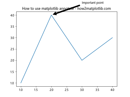
In this example, we create a simple line plot and add an annotation pointing to the point (2, 4) with the text “Important point”. The xy parameter specifies the point to annotate, while xytext determines the position of the annotation text. The arrowprops dictionary defines the properties of the arrow connecting the text to the point.
Customizing Text Annotations with Matplotlib Annotate
Matplotlib annotate offers various options to customize the appearance of text annotations. You can control the font size, color, style, and other properties to make your annotations stand out. Here’s an example demonstrating some of these customization options:
import matplotlib.pyplot as plt fig, ax = plt.subplots()
ax.plot([1, 2, 3, 4], [1, 4, 2, 3])
ax.annotate('Custom annotation', xy=(3, 2), xytext=(3.5, 2.5),
            fontsize=12, fontweight='bold', color='red',
            arrowprops=dict(facecolor='red', edgecolor='black', shrink=0.05))
plt.title('Customizing text annotations - how2matplotlib.com')
plt.show()
Output:
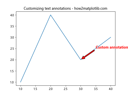
In this example, we’ve customized the annotation text by setting the font size to 12, making it bold, and changing its color to red. We’ve also modified the arrow properties to match the text color.
Using Matplotlib Annotate with Different Coordinate Systems
Matplotlib annotate supports different coordinate systems, allowing you to position annotations relative to the data, axes, or figure. Here’s an example demonstrating the use of different coordinate systems:
import matplotlib.pyplot as plt fig, ax = plt.subplots()
ax.plot([1, 2, 3, 4], [1, 4, 2, 3])
# Data coordinates
ax.annotate('Data coords', xy=(2, 4), xytext=(2.5, 4.5),
            arrowprops=dict(facecolor='black', shrink=0.05))
# Axes coordinates
ax.annotate('Axes coords', xy=(0.5, 0.5), xytext=(0.7, 0.7),
            xycoords='axes fraction', textcoords='axes fraction',
            arrowprops=dict(facecolor='blue', shrink=0.05))
# Figure coordinates
ax.annotate('Figure coords', xy=(0.2, 0.2), xytext=(0.3, 0.3),
            xycoords='figure fraction', textcoords='figure fraction',
            arrowprops=dict(facecolor='green', shrink=0.05))
plt.title('Coordinate systems in matplotlib annotate - how2matplotlib.com')
plt.show()
Output:
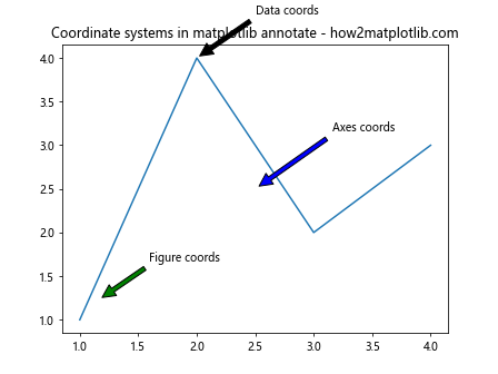
This example demonstrates three different coordinate systems: data coordinates (default), axes coordinates, and figure coordinates. By specifying the xycoords and textcoords parameters, you can control how the annotation positions are interpreted.
Adding Arrows and Shapes with Matplotlib Annotate
Matplotlib annotate is not limited to text annotations; you can also use it to add arrows and other shapes to your plots. Here’s an example showing how to create different types of arrows:
import matplotlib.pyplot as plt fig, ax = plt.subplots()
ax.plot([1, 2, 3, 4], [1, 4, 2, 3])
# Simple arrow
ax.annotate('Simple arrow', xy=(2, 4), xytext=(3, 4.5),
            arrowprops=dict(facecolor='black', shrink=0.05))
# Fancy arrow
ax.annotate('Fancy arrow', xy=(3, 2), xytext=(3.5, 1.5),
            arrowprops=dict(facecolor='red', edgecolor='black', shrink=0.05,
                            width=4, headwidth=12, headlength=10))
# Curved arrow
ax.annotate('Curved arrow', xy=(1, 1), xytext=(2, 0.5),
            arrowprops=dict(facecolor='green', edgecolor='black', shrink=0.05,
                            connectionstyle="arc3,rad=0.3"))
plt.title('Arrow types in matplotlib annotate - how2matplotlib.com')
plt.show()
Output:
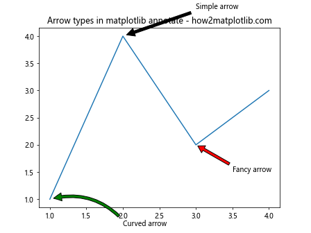
This example demonstrates three different types of arrows: a simple arrow, a fancy arrow with customized width and head properties, and a curved arrow using the connectionstyle parameter.
Using Matplotlib Annotate for Data Highlighting
Matplotlib annotate is particularly useful for highlighting specific data points or regions in your plots. Here’s an example that demonstrates how to use annotations to draw attention to important features in a scatter plot:
import matplotlib.pyplot as plt
import numpy as np np.random.seed(42)
x = np.random.rand(50)
y = np.random.rand(50) fig, ax = plt.subplots()
ax.scatter(x, y)
# Highlight the point with maximum y-value
max_y_index = np.argmax(y)
ax.annotate('Maximum y-value', xy=(x[max_y_index], y[max_y_index]),
            xytext=(0.6, 0.95), textcoords='axes fraction',
            arrowprops=dict(facecolor='red', shrink=0.05))
# Highlight a cluster of points
ax.annotate('Cluster', xy=(0.3, 0.3), xytext=(0.1, 0.8),
            textcoords='axes fraction',
            arrowprops=dict(facecolor='green', shrink=0.05))
plt.title('Data highlighting with matplotlib annotate - how2matplotlib.com')
plt.show()
Output:
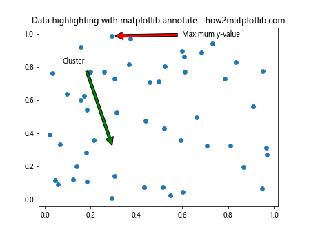
In this example, we create a scatter plot and use matplotlib annotate to highlight the point with the maximum y-value and a cluster of points in the lower-left corner of the plot.
Creating Annotation Boxes with Matplotlib Annotate
Matplotlib annotate allows you to create annotation boxes, which are useful for adding more detailed information to your plots. Here’s an example demonstrating how to create and customize annotation boxes:
import matplotlib.pyplot as plt
from matplotlib.patches import BoxStyle
fig, ax = plt.subplots()
ax.plot([1, 2, 3, 4], [1, 4, 2, 3])
# Simple annotation box
ax.annotate('Simple box', xy=(2, 4), xytext=(3, 4.5),
            bbox=dict(boxstyle='round', facecolor='white', edgecolor='black'))
# Fancy annotation box
ax.annotate('Fancy box', xy=(3, 2), xytext=(3.5, 1.5),
            bbox=dict(boxstyle='sawtooth,pad=0.6', facecolor='yellow', edgecolor='red'))
# Custom annotation box
custom_style = BoxStyle("round", pad=0.4, rounding_size=0.2)
ax.annotate('Custom box', xy=(1, 1), xytext=(2, 0.5),
            bbox=dict(boxstyle=custom_style, facecolor='lightblue', edgecolor='blue'))
plt.title('Annotation boxes with matplotlib annotate - how2matplotlib.com')
plt.show()
Output:
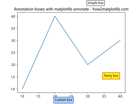
This example shows three different types of annotation boxes: a simple rounded box, a fancy sawtooth box, and a custom box with specific rounding properties.
Creating Interactive Annotations with Matplotlib Annotate
Matplotlib annotate can be combined with interactive features to create dynamic annotations that respond to user input. Here’s an example demonstrating how to create annotations that appear when hovering over data points:
import matplotlib.pyplot as plt
import numpy as np
from matplotlib.backends.backend_agg import FigureCanvasAgg as FigureCanvas
fig, ax = plt.subplots()
x = np.linspace(0, 10, 100)
y = np.sin(x)
line, = ax.plot(x, y)
annot = ax.annotate("", xy=(0,0), xytext=(20,20), textcoords="offset points",
                    bbox=dict(boxstyle="round", fc="w"),
                    arrowprops=dict(arrowstyle="->"))
annot.set_visible(False)
def update_annot(ind):
    x, y = line.get_data()
    annot.xy = (x[ind["ind"][0]], y[ind["ind"][0]])
    text = f"({x[ind['ind'][0]]:.2f}, {y[ind['ind'][0]]:.2f})"
    annot.set_text(text)
    annot.get_bbox_patch().set_alpha(0.4)
def hover(event):
    vis = annot.get_visible()
    if event.inaxes == ax:
        cont, ind = line.contains(event)
        if cont:
            update_annot(ind)
            annot.set_visible(True)
            fig.canvas.draw_idle()
        else:
            if vis:
                annot.set_visible(False)
                fig.canvas.draw_idle()
fig.canvas.mpl_connect("motion_notify_event", hover)
plt.title('Interactive annotations with matplotlib annotate - how2matplotlib.com')
plt.show()
Output:
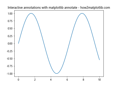
This example creates a line plot with interactive annotations that appear when the user hovers over data points. The annotations display the x and y coordinates of the selected point.
Using Matplotlib Annotate for Mathematical Expressions
Matplotlib annotate supports LaTeX-style mathematical expressions, allowing you to add complex equations and formulas to your plots. Here’s an example demonstrating how to use mathematical expressions in annotations:
import matplotlib.pyplot as plt
import numpy as np
x = np.linspace(-2*np.pi, 2*np.pi, 100)
y = np.sin(x)
fig, ax = plt.subplots()
ax.plot(x, y)
# Add a simple mathematical expression
ax.annotate(r'$\sin(x)$', xy=(0, 0), xytext=(1, 0.5),
            arrowprops=dict(facecolor='black', shrink=0.05))
# Add a more complex mathematical expression
ax.annotate(r'$\int_{-\infty}^{\infty} e^{-x^2} dx = \sqrt{\pi}$',
            xy=(np.pi, 0), xytext=(2, -0.5),
            bbox=dict(boxstyle='round', facecolor='white', edgecolor='black'))
plt.title('Mathematical expressions with matplotlib annotate - how2matplotlib.com')
plt.show()
Output:
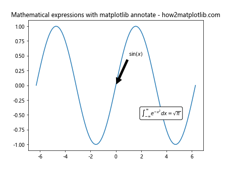
In this example, we add two annotations with mathematical expressions: a simple sine function and a more complex integral equation.
Using Matplotlib Annotate for Subplot Annotations
Matplotlib annotate can be used to add annotations to individual subplots or to create annotations that span multiple subplots. Here’s an example demonstrating both techniques:
import matplotlib.pyplot as plt
import numpy as np
fig, (ax1, ax2) = plt.subplots(1, 2, figsize=(12, 5))
# Plot data in both subplots
x = np.linspace(0, 10, 100)
ax1.plot(x, np.sin(x))
ax2.plot(x, np.cos(x))
# Annotate individual subplots
ax1.annotate('Sin wave', xy=(np.pi/2, 1), xytext=(4, 0.5),
             arrowprops=dict(facecolor='black', shrink=0.05))
ax2.annotate('Cos wave', xy=(0, 1), xytext=(2, 0.5),
             arrowprops=dict(facecolor='black', shrink=0.05))
# Add an annotation that spans both subplots
fig.text(0.5, 0.95, 'Trigonometric Functions', ha='center', va='top',
         bbox=dict(boxstyle='round', facecolor='wheat', alpha=0.5))
ax1.set_title('Sine Function')
ax2.set_title('Cosine Function')
fig.suptitle('Subplot annotations with matplotlib annotate - how2matplotlib.com')
plt.tight_layout()
plt.show()
Output:
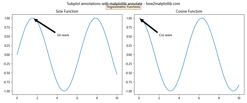
In this example, we create two subplots and add individual annotations to each subplot using matplotlib annotate. We also demonstrate how to add a text annotation that spans both subplots using fig.text().
Animating Annotations with Matplotlib Annotate
Matplotlib annotate can be used in conjunction with animation features to create dynamic, moving annotations. Here’s an example that demonstrates how to create an animated annotation:
import matplotlib.pyplot as plt
import numpy as np
from matplotlib.animation import FuncAnimation
fig, ax = plt.subplots()
x = np.linspace(0, 2*np.pi, 100)
line, = ax.plot(x, np.sin(x))
annotation = ax.annotate('', xy=(0, 0), xytext=(20, 20),
                         textcoords="offset points",
                         bbox=dict(boxstyle="round", fc="w"),
                         arrowprops=dict(arrowstyle="->"))
def update(frame):
    y = np.sin(x + frame/10)
    line.set_ydata(y)
    max_index = np.argmax(y)
    annotation.xy = (x[max_index], y[max_index])
    annotation.set_text(f'Max: ({x[max_index]:.2f}, {y[max_index]:.2f})')
    return line, annotation
ani = FuncAnimation(fig, update, frames=np.linspace(0, 2*np.pi, 100),
                    blit=True, interval=50)
plt.title('Animated annotations with matplotlib annotate - how2matplotlib.com')
plt.show()
Output:
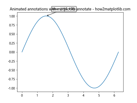
This example creates an animated sine wave with a moving annotation that always points to the maximum value of the wave.
Using Matplotlib Annotate for Image Annotations
Matplotlib annotate can also be used to add annotations to images. Here’s an example demonstrating how to annotate specific regions of an image:
import matplotlib.pyplot as plt
import numpy as np
# Create a sample image
image = np.random.rand(100, 100)
fig, ax = plt.subplots()
ax.imshow(image, cmap='viridis')
# Annotate a specific region
ax.annotate('Interesting region', xy=(30, 40), xytext=(60, 80),
            arrowprops=dict(facecolor='white', shrink=0.05))
# Add a text box annotation
ax.text(10, 90, 'Image analysis', bbox=dict(facecolor='white', alpha=0.7))
plt.title('Image annotations with matplotlib annotate - how2matplotlib.com')
plt.axis('off')
plt.show()
Output:
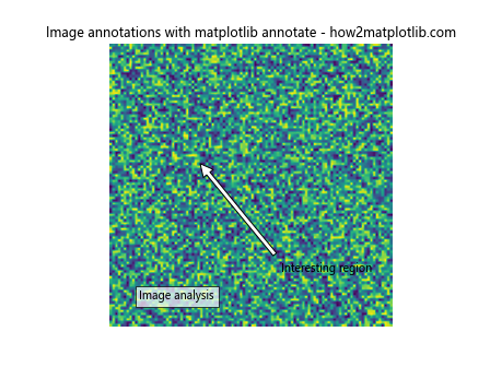
In this example, we create a random image and add annotations to highlight a specific region and provide additional information about the image.
Advanced Techniques with Matplotlib Annotate
Matplotlib annotate offers advanced features for creating complex annotations. Here’s an example demonstrating some advanced techniques:
import matplotlib.pyplot as plt
import numpy as np
from matplotlib.patches import Circle
fig, ax = plt.subplots(figsize=(10, 8))
x = np.linspace(0, 10, 100)
y = np.sin(x)
ax.plot(x, y)
# Create a circular patch
circle = Circle((5, 0), 0.5, fill=False)
ax.add_patch(circle)
# Annotate with a curved arrow and custom text positioning
ax.annotate('Circular region', xy=(5, 0), xytext=(7, 1),
            arrowprops=dict(facecolor='black', shrink=0.05,
                            connectionstyle="arc3,rad=0.3"),
            bbox=dict(boxstyle="round,pad=0.3", fc="yellow", ec="b", lw=2),
            ha='center', va='center')
# Add a rotated annotation
ax.annotate('Rotated text', xy=(2, 0.5), xytext=(3, 0.8),
            rotation=45,
            arrowprops=dict(facecolor='red', shrink=0.05))
# Create an annotation with multiple arrows
ax.annotate('Multi-arrow', xy=(8, 0.5), xytext=(9, 0.8),
            arrowprops=dict(facecolor='green', shrink=0.05),
            bbox=dict(boxstyle="round", fc="w"))
ax.annotate('', xy=(8, 0.7), xytext=(9, 0.8),
            arrowprops=dict(facecolor='green', shrink=0.05))
plt.title('Advanced techniques with matplotlib annotate - how2matplotlib.com')
plt.show()
Output:
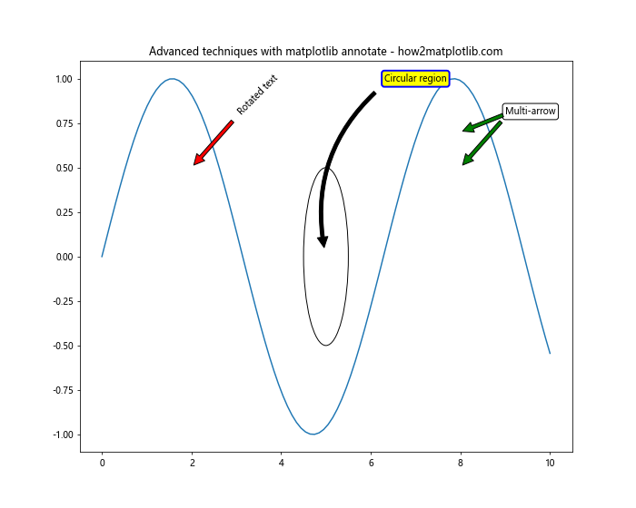
This example demonstrates advanced techniques such as adding circular patches, creating curved arrows, rotating text, and using multiple arrows for a single annotation.
Best Practices for Using Matplotlib Annotate
When using matplotlib annotate, it’s important to follow some best practices to ensure your annotations are effective and visually appealing. Here are some tips:
- Keep annotations concise and relevant.
- Use appropriate font sizes and colors that contrast well with the background.
- Position annotations to avoid overlapping with important data points.
- Use arrows sparingly and only when necessary to highlight specific points.
- Consider using different styles of annotations for different types of information.
- Test your annotations with different plot sizes to ensure they remain readable.
Here’s an example that demonstrates these best practices:
import matplotlib.pyplot as plt
import numpy as np
fig, ax = plt.subplots(figsize=(10, 6))
x = np.linspace(0, 10, 100)
y = np.sin(x) * np.exp(-x/10)
ax.plot(x, y)
# Concise annotation with appropriate positioning
ax.annotate('Peak', xy=(1.6, 0.9), xytext=(3, 1),
            arrowprops=dict(facecolor='black', shrink=0.05),
            fontsize=10, ha='center')
# Annotation with contrasting color and no arrow
ax.text(5, 0.2, 'Decay region', color='red', fontsize=12,
        bbox=dict(facecolor='white', edgecolor='none', alpha=0.7))
# Annotation positioned to avoid data overlap
ax.annotate('Oscillations', xy=(8, -0.2), xytext=(8, -0.4),
            arrowprops=dict(facecolor='blue', shrink=0.05),
            fontsize=10, ha='center')
plt.title('Best practices for matplotlib annotate - how2matplotlib.com')
plt.xlabel('X-axis')
plt.ylabel('Y-axis')
plt.show()
Output:
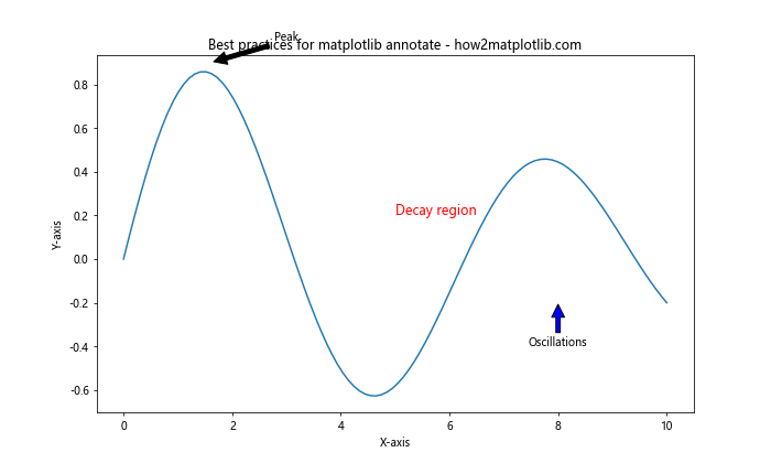
This example demonstrates the use of concise annotations, appropriate positioning, contrasting colors, and different annotation styles to effectively highlight various aspects of the plot.
Matplotlib annotate Conclusion
Matplotlib annotate is a powerful tool for adding context and highlighting important features in your data visualizations. By mastering the various options and techniques available with matplotlib annotate, you can create more informative and visually appealing plots. Remember to experiment with different styles, positions, and customization options to find the best way to convey information in your specific use case.