Matplotlib contour plots are powerful tools for visualizing three-dimensional data on a two-dimensional plane. This article will dive deep into the world of matplotlib contour plots, exploring their various features, customization options, and practical applications. Whether you’re a data scientist, researcher, or visualization enthusiast, this guide will help you master the art of creating stunning contour plots using matplotlib.
Matplotlib contour Recommended Articles
Understanding Matplotlib Contour Plots
Matplotlib contour plots are used to represent three-dimensional data on a two-dimensional plane. They consist of contour lines that connect points of equal value, similar to topographic maps. These plots are particularly useful for visualizing scalar fields, such as temperature distributions, pressure gradients, or elevation maps.
Let’s start with a basic example of creating a matplotlib contour plot:
import numpy as np
import matplotlib.pyplot as plt
# Generate sample data
x = np.linspace(-5, 5, 100)
y = np.linspace(-5, 5, 100)
X, Y = np.meshgrid(x, y)
Z = np.sin(np.sqrt(X**2 + Y**2))
# Create the contour plot
plt.figure(figsize=(10, 8))
contour = plt.contour(X, Y, Z)
plt.colorbar(contour)
plt.title("Basic Matplotlib Contour Plot - how2matplotlib.com")
plt.xlabel("X-axis")
plt.ylabel("Y-axis")
plt.show()
Output:
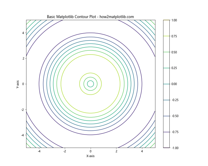
In this example, we generate a sample dataset using numpy and create a basic contour plot using matplotlib. The plt.contour() function is the key to creating contour plots, and we’ll explore its various parameters and options throughout this article.
Customizing Contour Levels
One of the most important aspects of matplotlib contour plots is the ability to customize contour levels. By default, matplotlib automatically chooses the number and values of contour levels, but you can specify them manually for more control over your visualization.
Here’s an example of how to set custom contour levels:
import numpy as np
import matplotlib.pyplot as plt
# Generate sample data
x = np.linspace(-5, 5, 100)
y = np.linspace(-5, 5, 100)
X, Y = np.meshgrid(x, y)
Z = np.sin(np.sqrt(X**2 + Y**2))
# Create the contour plot with custom levels
plt.figure(figsize=(10, 8))
levels = [-0.75, -0.5, -0.25, 0, 0.25, 0.5, 0.75]
contour = plt.contour(X, Y, Z, levels=levels)
plt.colorbar(contour)
plt.title("Matplotlib Contour Plot with Custom Levels - how2matplotlib.com")
plt.xlabel("X-axis")
plt.ylabel("Y-axis")
plt.show()
Output:
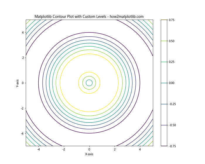
In this example, we specify custom contour levels using the levels parameter in the plt.contour() function. This allows you to focus on specific ranges of values or create more visually appealing plots.
Adding Labels to Contour Lines
To make your matplotlib contour plots more informative, you can add labels to the contour lines. This is particularly useful when you want to display the exact values represented by each contour line.
Here’s an example of how to add labels to contour lines:
import numpy as np
import matplotlib.pyplot as plt
# Generate sample data
x = np.linspace(-5, 5, 100)
y = np.linspace(-5, 5, 100)
X, Y = np.meshgrid(x, y)
Z = np.sin(np.sqrt(X**2 + Y**2))
# Create the contour plot with labels
plt.figure(figsize=(10, 8))
contour = plt.contour(X, Y, Z)
plt.clabel(contour, inline=True, fontsize=8)
plt.colorbar(contour)
plt.title("Matplotlib Contour Plot with Labels - how2matplotlib.com")
plt.xlabel("X-axis")
plt.ylabel("Y-axis")
plt.show()
Output:
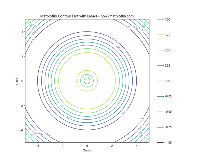
In this example, we use the plt.clabel() function to add labels to the contour lines. The inline=True parameter ensures that the labels are placed directly on the contour lines, and fontsize controls the size of the label text.
Creating Filled Contour Plots
While regular contour plots use lines to represent equal values, filled contour plots use colored regions to represent ranges of values. This can be particularly effective for visualizing continuous data distributions.
Here’s an example of how to create a filled contour plot:
import numpy as np
import matplotlib.pyplot as plt
# Generate sample data
x = np.linspace(-5, 5, 100)
y = np.linspace(-5, 5, 100)
X, Y = np.meshgrid(x, y)
Z = np.sin(np.sqrt(X**2 + Y**2))
# Create the filled contour plot
plt.figure(figsize=(10, 8))
contourf = plt.contourf(X, Y, Z, cmap='viridis')
plt.colorbar(contourf)
plt.title("Matplotlib Filled Contour Plot - how2matplotlib.com")
plt.xlabel("X-axis")
plt.ylabel("Y-axis")
plt.show()
Output:
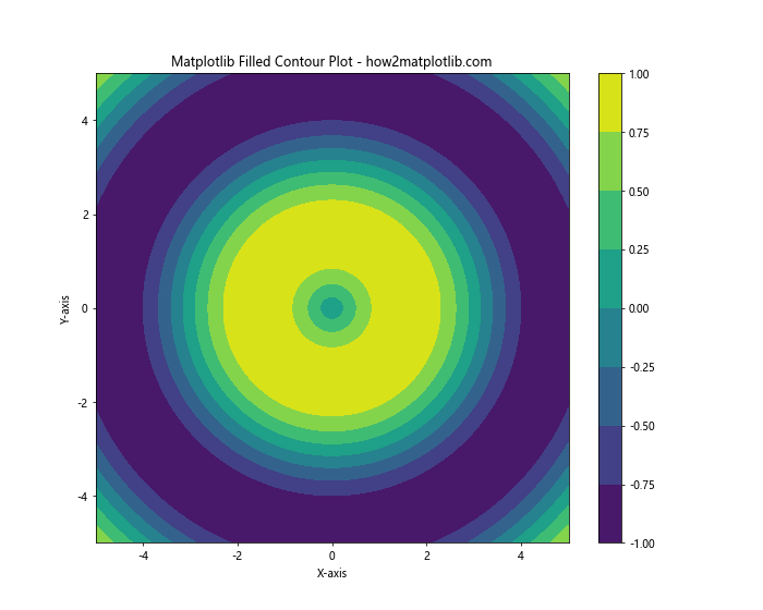
In this example, we use the plt.contourf() function to create a filled contour plot. The cmap parameter allows you to specify a colormap for the filled regions.
Combining Contour and Filled Contour Plots
For a more comprehensive visualization, you can combine regular contour lines with filled contour regions. This approach provides both the precise value information of contour lines and the overall distribution view of filled contours.
Here’s an example of how to combine contour and filled contour plots:
import numpy as np
import matplotlib.pyplot as plt
# Generate sample data
x = np.linspace(-5, 5, 100)
y = np.linspace(-5, 5, 100)
X, Y = np.meshgrid(x, y)
Z = np.sin(np.sqrt(X**2 + Y**2))
# Create the combined contour plot
plt.figure(figsize=(10, 8))
contourf = plt.contourf(X, Y, Z, cmap='viridis', alpha=0.7)
contour = plt.contour(X, Y, Z, colors='black', linewidths=0.5)
plt.clabel(contour, inline=True, fontsize=8)
plt.colorbar(contourf)
plt.title("Combined Matplotlib Contour Plot - how2matplotlib.com")
plt.xlabel("X-axis")
plt.ylabel("Y-axis")
plt.show()
Output:
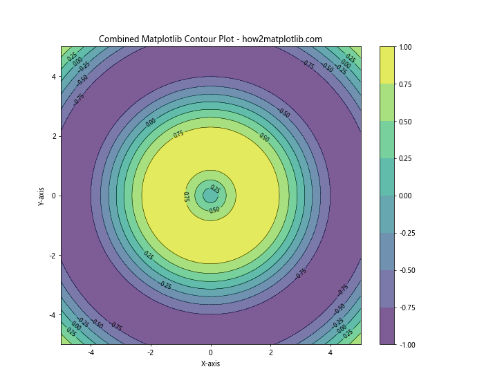
In this example, we first create a filled contour plot using plt.contourf(), then overlay regular contour lines using plt.contour(). The alpha parameter in plt.contourf() controls the transparency of the filled regions, allowing the contour lines to be visible.
Customizing Contour Colors
Matplotlib offers extensive options for customizing the colors of your contour plots. You can use predefined colormaps, create custom color schemes, or even specify individual colors for each contour level.
Here’s an example of using a custom colormap for a contour plot:
import numpy as np
import matplotlib.pyplot as plt
from matplotlib.colors import LinearSegmentedColormap
# Generate sample data
x = np.linspace(-5, 5, 100)
y = np.linspace(-5, 5, 100)
X, Y = np.meshgrid(x, y)
Z = np.sin(np.sqrt(X**2 + Y**2))
# Create a custom colormap
colors = ['blue', 'cyan', 'yellow', 'red']
n_bins = 100
cmap = LinearSegmentedColormap.from_list('custom_cmap', colors, N=n_bins)
# Create the contour plot with custom colormap
plt.figure(figsize=(10, 8))
contour = plt.contour(X, Y, Z, cmap=cmap)
plt.colorbar(contour)
plt.title("Matplotlib Contour Plot with Custom Colormap - how2matplotlib.com")
plt.xlabel("X-axis")
plt.ylabel("Y-axis")
plt.show()
Output:
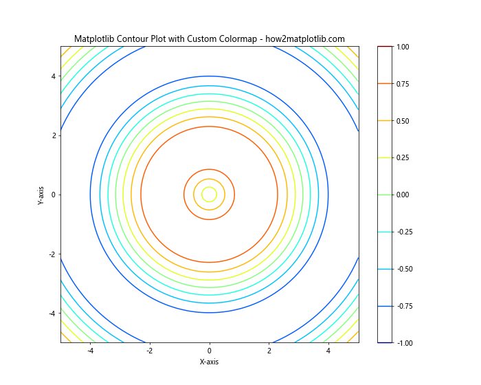
In this example, we create a custom colormap using LinearSegmentedColormap.from_list() and apply it to our contour plot using the cmap parameter.
Adding a Colorbar
A colorbar is an essential component of matplotlib contour plots, as it provides a legend that maps colors to values. While we’ve included colorbars in previous examples, let’s explore some additional customization options.
Here’s an example of customizing the colorbar:
import numpy as np
import matplotlib.pyplot as plt
# Generate sample data
x = np.linspace(-5, 5, 100)
y = np.linspace(-5, 5, 100)
X, Y = np.meshgrid(x, y)
Z = np.sin(np.sqrt(X**2 + Y**2))
# Create the contour plot with custom colorbar
plt.figure(figsize=(12, 8))
contour = plt.contour(X, Y, Z, cmap='coolwarm')
cbar = plt.colorbar(contour, orientation='horizontal', pad=0.1, aspect=30)
cbar.set_label('Value', fontsize=12)
cbar.ax.tick_params(labelsize=10)
plt.title("Matplotlib Contour Plot with Custom Colorbar - how2matplotlib.com")
plt.xlabel("X-axis")
plt.ylabel("Y-axis")
plt.show()
Output:
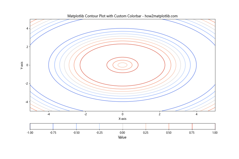
In this example, we customize the colorbar by changing its orientation, adjusting its position and size, and modifying the label and tick properties.
Creating 3D Contour Plots
While traditional contour plots are 2D representations of 3D data, matplotlib also allows you to create true 3D contour plots using the mpl_toolkits.mplot3d module.
Here’s an example of creating a 3D contour plot:
import numpy as np
import matplotlib.pyplot as plt
from mpl_toolkits.mplot3d import Axes3D
# Generate sample data
x = np.linspace(-5, 5, 100)
y = np.linspace(-5, 5, 100)
X, Y = np.meshgrid(x, y)
Z = np.sin(np.sqrt(X**2 + Y**2))
# Create the 3D contour plot
fig = plt.figure(figsize=(12, 8))
ax = fig.add_subplot(111, projection='3d')
contour = ax.contour(X, Y, Z, cmap='viridis')
ax.set_title("3D Matplotlib Contour Plot - how2matplotlib.com")
ax.set_xlabel("X-axis")
ax.set_ylabel("Y-axis")
ax.set_zlabel("Z-axis")
plt.colorbar(contour)
plt.show()
Output:
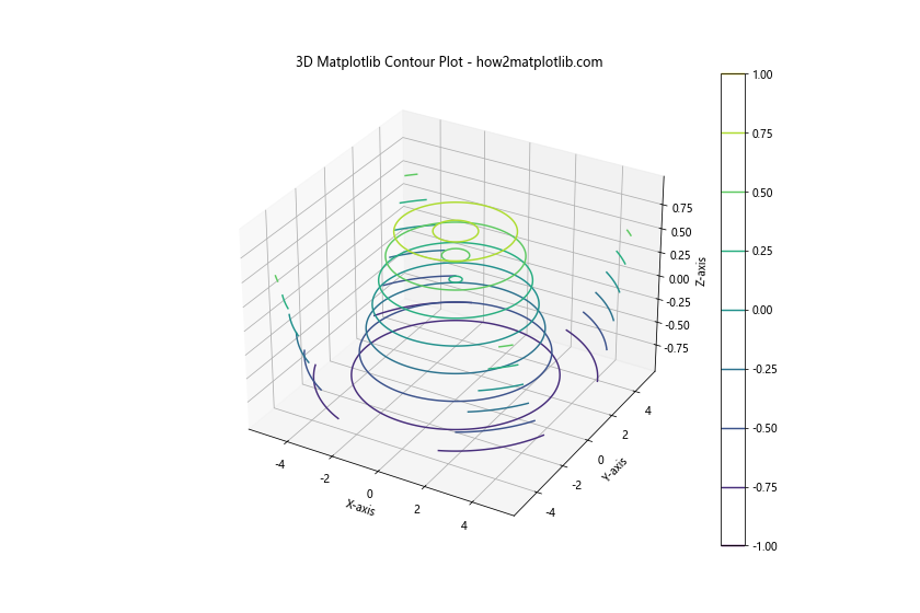
In this example, we use the Axes3D class to create a 3D axes and plot the contours on a three-dimensional surface.
Handling Irregular Data
So far, we’ve been working with regularly gridded data. However, matplotlib contour plots can also handle irregular data using the tricontour() and tricontourf() functions.
Here’s an example of creating a contour plot with irregular data:
import numpy as np
import matplotlib.pyplot as plt
# Generate irregular sample data
np.random.seed(42)
x = np.random.rand(1000) * 10 - 5
y = np.random.rand(1000) * 10 - 5
z = np.sin(np.sqrt(x**2 + y**2))
# Create the irregular contour plot
plt.figure(figsize=(10, 8))
contour = plt.tricontour(x, y, z, cmap='viridis')
plt.colorbar(contour)
plt.title("Matplotlib Contour Plot with Irregular Data - how2matplotlib.com")
plt.xlabel("X-axis")
plt.ylabel("Y-axis")
plt.show()
Output:
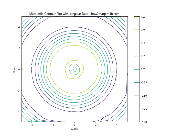
In this example, we use plt.tricontour() to create a contour plot from irregularly spaced data points.
Adding Contour Plots to Subplots
Matplotlib allows you to create multiple subplots within a single figure, which can be useful for comparing different datasets or visualizing various aspects of the same data.
Here’s an example of creating multiple contour plots in subplots:
import numpy as np
import matplotlib.pyplot as plt # Generate sample data
x = np.linspace(-5, 5, 100)
y = np.linspace(-5, 5, 100)
X, Y = np.meshgrid(x, y)
Z1 = np.sin(np.sqrt(X**2 + Y**2))
Z2 = np.cos(np.sqrt(X**2 + Y**2)) # Create subplots with contour plots
fig, (ax1, ax2) = plt.subplots(1, 2, figsize=(16, 6))
contour1 = ax1.contour(X, Y, Z1, cmap='viridis')
ax1.set_title("Sine Contour - how2matplotlib.com")
ax1.set_xlabel("X-axis")
ax1.set_ylabel("Y-axis")
plt.colorbar(contour1, ax=ax1)
contour2 = ax2.contour(X, Y, Z2, cmap='plasma')
ax2.set_title("Cosine Contour - how2matplotlib.com")
ax2.set_xlabel("X-axis")
ax2.set_ylabel("Y-axis")
plt.colorbar(contour2, ax=ax2)
plt.tight_layout()
plt.show()
Output:
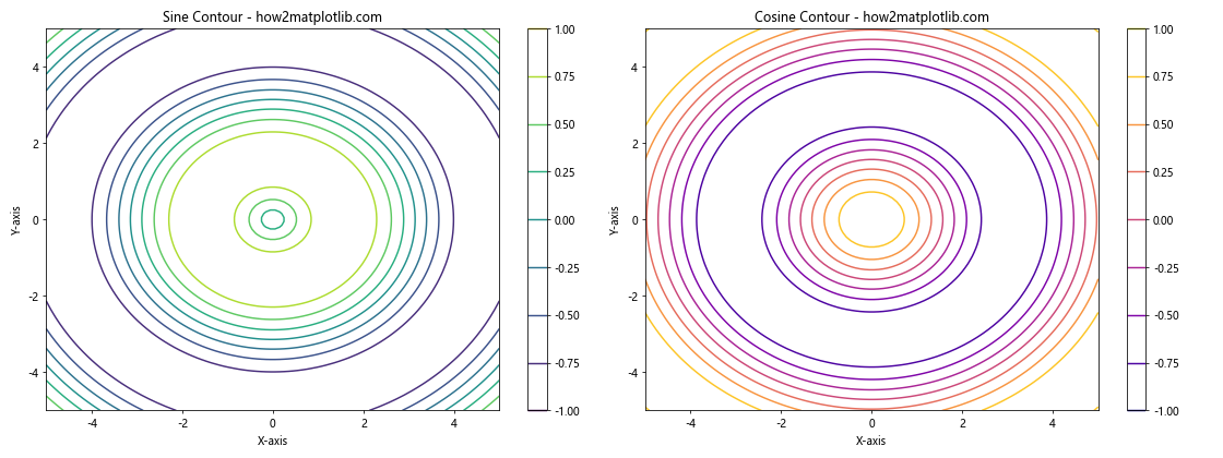
In this example, we create two subplots side by side, each containing a different contour plot.
Animating Contour Plots
Matplotlib can be used to create animated contour plots, which can be particularly useful for visualizing time-varying data or parameter sweeps.
Here’s an example of creating a simple animated contour plot:
import numpy as np
import matplotlib.pyplot as plt
from matplotlib.animation import FuncAnimation # Generate sample data
x = np.linspace(-5, 5, 100)
y = np.linspace(-5, 5, 100)
X, Y = np.meshgrid(x, y) # Create the figure and initial plot
fig, ax = plt.subplots(figsize=(10, 8))
contour = ax.contourf(X, Y, np.zeros_like(X))
plt.colorbar(contour)
ax.set_title("Animated Matplotlib Contour Plot - how2matplotlib.com")
ax.set_xlabel("X-axis")
ax.set_ylabel("Y-axis")
# Animation update function
def update(frame):
    Z = np.sin(np.sqrt(X**2 + Y**2) - frame * 0.1)
    ax.clear()
    contour = ax.contourf(X, Y, Z, cmap='viridis')
    ax.set_title(f"Frame {frame} - how2matplotlib.com")
    ax.set_xlabel("X-axis")
    ax.set_ylabel("Y-axis")
    return contour,
# Create the animation
anim = FuncAnimation(fig, update, frames=100, interval=50, blit=True)
plt.show()
Output:
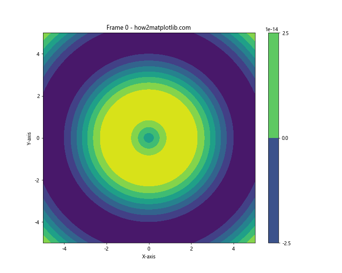
In this example, we use the FuncAnimation class to create an animated contour plot that changes over time.
Contour Plots with Masked Data
Sometimes, you may want to exclude certain regions from your contour plot. Matplotlib allows you to use masked arrays to achieve this effect.
Here’s an example of creating a contour plot with masked data:
import numpy as np
import matplotlib.pyplot as plt
# Generate sample data
x = np.linspace(-5, 5, 100)
y = np.linspace(-5, 5, 100)
X, Y = np.meshgrid(x, y)
Z = np.sin(np.sqrt(X**2 + Y**2))
# Create a mask
mask = np.sqrt(X**2 + Y**2) > 4
# Apply the mask to the data
Z_masked = np.ma.masked_array(Z, mask)
# Create the contour plot with masked data
plt.figure(figsize=(10, 8))
contour = plt.contourf(X, Y, Z_masked, cmap='viridis')
plt.colorbar(contour)
plt.title("Matplotlib Contour Plot with Masked Data - how2matplotlib.com")
plt.xlabel("X-axis")
plt.ylabel("Y-axis")
plt.show()
Output:
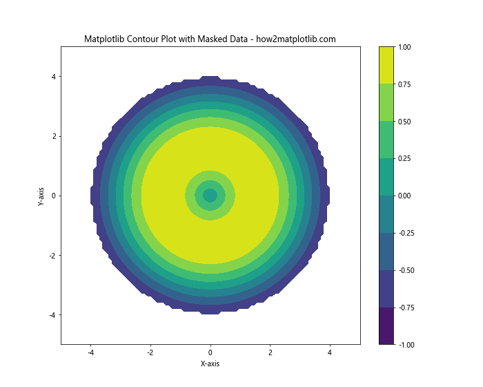
In this example, we create a mask to exclude data points where the radius is greater than 4, resulting in a circular contour plot.
Contour Plots with Logarithmic Scales
For data that spans multiple orders of magnitude, it can be useful to create contour plots with logarithmic scales.
Here’s an example of creating a contour plot with logarithmic scales:
import numpy as np
import matplotlib.pyplot as plt
# Generate sample data
x = np.logspace(0, 3, 100)
y = np.logspace(0, 3, 100)
X, Y = np.meshgrid(x, y)
Z = np.log10(X * Y)
# Create the contour plot with logarithmic scales
plt.figure(figsize=(10, 8))
contour = plt.contourf(X, Y, Z, cmap='viridis', locator=plt.LogLocator())
plt.colorbar(contour)
plt.xscale('log')
plt.yscale('log')
plt.title("Matplotlib Contour Plot with Logarithmic Scales - how2matplotlib.com")
plt.xlabel("X-axis (log scale)")
plt.ylabel("Y-axis (log scale)")
plt.show()
Output:
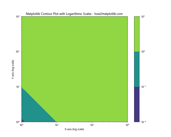
In this example, we use np.logspace() to generate logarithmically spaced data and set both x and y axes to logarithmic scales using plt.xscale('log') and plt.yscale('log').
Contour Plots with Polar Coordinates
Matplotlib contour plots can also be created using polar coordinates, which can be useful for visualizing circular or radial data.
Here’s an example of creating a contour plot in polar coordinates:
import numpy as np
import matplotlib.pyplot as plt
# Generate sample data in polar coordinates
r = np.linspace(0, 2, 100)
theta = np.linspace(0, 2*np.pi, 100)
R, Theta = np.meshgrid(r, theta)
Z = R * np.sin(Theta)
# Create the polar contour plot
plt.figure(figsize=(10, 8))
ax = plt.subplot(111, projection='polar')
contour = ax.contourf(Theta, R, Z, cmap='viridis')
plt.colorbar(contour)
ax.set_title("Matplotlib Polar Contour Plot - how2matplotlib.com")
plt.show()
Output:
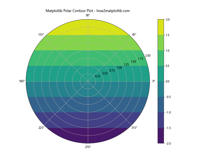
In this example, we use polar coordinates to create a radial contour plot.
Contour Plots with Streamlines
Combining contour plots with streamlines can be an effective way to visualize both scalar and vector fields simultaneously.
Here’s an example of creating a contour plot with streamlines:
import numpy as np
import matplotlib.pyplot as plt
# Generate sample data
x = np.linspace(-5, 5, 100)
y = np.linspace(-5, 5, 100)
X, Y = np.meshgrid(x, y)
Z = np.sin(np.sqrt(X**2 + Y**2))
# Calculate gradient for streamlines
dx, dy = np.gradient(Z)
# Create the contour plot with streamlines
plt.figure(figsize=(10, 8))
contour = plt.contourf(X, Y, Z, cmap='viridis', alpha=0.7)
plt.colorbar(contour)
plt.streamplot(X, Y, dx, dy, color='white', linewidth=0.5, density=1, arrowsize=1)
plt.title("Matplotlib Contour Plot with Streamlines - how2matplotlib.com")
plt.xlabel("X-axis")
plt.ylabel("Y-axis")
plt.show()
Output:
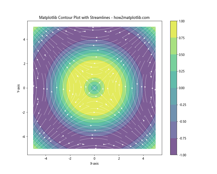
In this example, we calculate the gradient of the scalar field and use plt.streamplot() to add streamlines to the contour plot.
Advanced Customization Techniques
Matplotlib offers a wide range of customization options for contour plots. Let’s explore some advanced techniques to create more visually appealing and informative plots.
Custom Contour Line Styles
You can customize the appearance of contour lines by specifying different line styles, colors, and widths.
import numpy as np
import matplotlib.pyplot as plt
# Generate sample data
x = np.linspace(-5, 5, 100)
y = np.linspace(-5, 5, 100)
X, Y = np.meshgrid(x, y)
Z = np.sin(np.sqrt(X**2 + Y**2))
# Create the contour plot with custom line styles
plt.figure(figsize=(10, 8))
levels = [-0.75, -0.5, -0.25, 0, 0.25, 0.5, 0.75]
contour = plt.contour(X, Y, Z, levels=levels,
                      colors=['r', 'g', 'b', 'k', 'b', 'g', 'r'],
                      linestyles=[':', '--', '-', '-', '-', '--', ':'],
                      linewidths=[1, 1, 1, 2, 1, 1, 1])
plt.clabel(contour, inline=True, fontsize=8)
plt.colorbar(contour)
plt.title("Matplotlib Contour Plot with Custom Line Styles - how2matplotlib.com")
plt.xlabel("X-axis")
plt.ylabel("Y-axis")
plt.show()
Output:
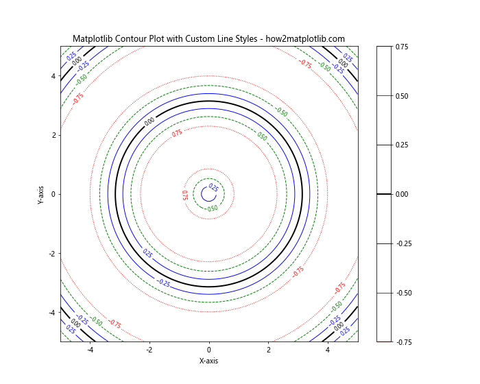
In this example, we specify custom colors, line styles, and line widths for each contour level.
Hatched Contour Plots
Hatched contour plots can be useful for distinguishing between different regions, especially in black and white prints.
import numpy as np
import matplotlib.pyplot as plt
# Generate sample data
x = np.linspace(-5, 5, 100)
y = np.linspace(-5, 5, 100)
X, Y = np.meshgrid(x, y)
Z = np.sin(np.sqrt(X**2 + Y**2))
# Create the hatched contour plot
plt.figure(figsize=(10, 8))
levels = [-0.75, -0.5, -0.25, 0, 0.25, 0.5, 0.75]
contourf = plt.contourf(X, Y, Z, levels=levels,
                        hatches=['/', '\\', '|', '-', '|', '\\', '/'],
                        cmap='gray')
contour = plt.contour(X, Y, Z, levels=levels, colors='k')
plt.clabel(contour, inline=True, fontsize=8)
plt.colorbar(contourf)
plt.title("Matplotlib Hatched Contour Plot - how2matplotlib.com")
plt.xlabel("X-axis")
plt.ylabel("Y-axis")
plt.show()
Output:
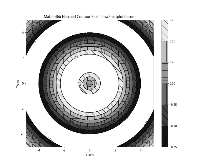
In this example, we use different hatch patterns for each contour level to create a visually distinct plot.
Practical Applications of Matplotlib Contour Plots
Matplotlib contour plots have numerous practical applications across various fields. Let’s explore some real-world examples to demonstrate their versatility.
Weather Map Visualization
Contour plots are commonly used in meteorology to visualize temperature, pressure, and precipitation patterns.
import numpy as np
import matplotlib.pyplot as plt
# Generate sample weather data
lat = np.linspace(30, 60, 100)
lon = np.linspace(-130, -60, 100)
LON, LAT = np.meshgrid(lon, lat)
temperature = 15 + 10 * np.sin((LON + LAT) / 10) + np.random.randn(100, 100)
# Create the weather map contour plot
plt.figure(figsize=(12, 8))
contourf = plt.contourf(LON, LAT, temperature, cmap='RdYlBu_r', levels=15)
contour = plt.contour(LON, LAT, temperature, colors='k', linewidths=0.5)
plt.clabel(contour, inline=True, fontsize=8, fmt='%1.1f')
plt.colorbar(contourf, label='Temperature (°C)')
plt.title("Weather Map Temperature Contours - how2matplotlib.com")
plt.xlabel("Longitude")
plt.ylabel("Latitude")
plt.show()
Output:
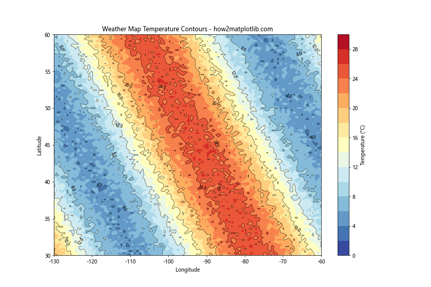
This example demonstrates how contour plots can be used to visualize temperature patterns across a geographic region.
Topographic Map
Contour plots are ideal for representing elevation data in topographic maps.
import numpy as np
import matplotlib.pyplot as plt
# Generate sample elevation data
x = np.linspace(0, 10, 100)
y = np.linspace(0, 10, 100)
X, Y = np.meshgrid(x, y)
Z = 2 * np.sin(X) + 3 * np.cos(Y) + np.random.randn(100, 100) * 0.5
# Create the topographic map contour plot
plt.figure(figsize=(12, 8))
contourf = plt.contourf(X, Y, Z, cmap='terrain', levels=20)
contour = plt.contour(X, Y, Z, colors='k', linewidths=0.5)
plt.clabel(contour, inline=True, fontsize=8, fmt='%1.1f')
plt.colorbar(contourf, label='Elevation (m)')
plt.title("Topographic Map Contours - how2matplotlib.com")
plt.xlabel("Easting")
plt.ylabel("Northing")
plt.show()
Output:
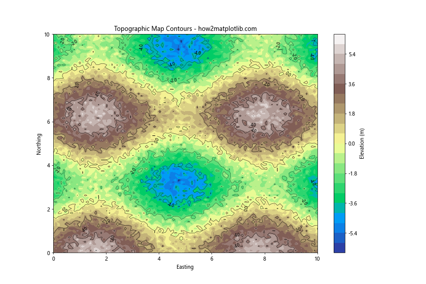
This example shows how contour plots can effectively represent elevation data in a topographic map.
Heat Map of Population Density
Contour plots can be used to visualize population density across a region.
import numpy as np
import matplotlib.pyplot as plt
# Generate sample population density data
x = np.linspace(0, 100, 100)
y = np.linspace(0, 100, 100)
X, Y = np.meshgrid(x, y)
Z = 1000 * np.exp(-((X-50)**2 + (Y-50)**2) / 1000) + np.random.randn(100, 100) * 50
# Create the population density heat map
plt.figure(figsize=(12, 8))
contourf = plt.contourf(X, Y, Z, cmap='YlOrRd', levels=20)
contour = plt.contour(X, Y, Z, colors='k', linewidths=0.5)
plt.clabel(contour, inline=True, fontsize=8, fmt='%1.0f')
plt.colorbar(contourf, label='Population Density (people/km²)')
plt.title("Population Density Heat Map - how2matplotlib.com")
plt.xlabel("X coordinate (km)")
plt.ylabel("Y coordinate (km)")
plt.show()
Output:
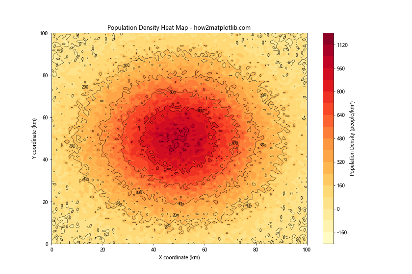
This example demonstrates how contour plots can be used to create a heat map of population density.
Best Practices for Creating Effective Matplotlib Contour Plots
To create effective and informative matplotlib contour plots, consider the following best practices:
- Choose appropriate contour levels: Select levels that highlight important features in your data without overwhelming the viewer.
- Use color wisely: Choose a colormap that effectively represents your data and is accessible to color-blind viewers.
- Add labels and annotations: Include clear labels for axes, titles, and contour lines to make your plot easily interpretable.
- Consider your audience: Tailor the complexity and style of your plot to your intended audience.
- Combine with other plot types: When appropriate, combine contour plots with other visualization techniques for a more comprehensive view of your data.
- Optimize for print and digital: Ensure your plot is legible in both color and grayscale, and consider how it will appear on different devices.
- Use consistent styling: Maintain a consistent style across multiple plots for easier comparison and a more professional appearance.
Matplotlib contour Conclusion
Matplotlib contour plots are powerful tools for visualizing three-dimensional data on a two-dimensional plane. From basic contour lines to filled contours, 3D representations, and animated plots, matplotlib offers a wide range of options for creating informative and visually appealing contour plots.
By mastering the techniques and best practices outlined in this comprehensive guide, you’ll be well-equipped to create stunning contour plots for various applications, from scientific visualization to data analysis and beyond. Remember to experiment with different options and customize your plots to best suit your specific needs and data.