Matplotlib boxplot is a powerful tool for visualizing the distribution of data in a concise and informative way. This article will dive deep into the world of box plots using matplotlib, exploring various aspects of creating, customizing, and interpreting these versatile visualizations. Whether you’re a data scientist, researcher, or analyst, mastering matplotlib boxplot will enhance your ability to communicate complex data distributions effectively.
Matplotlib boxplot Recommended Articles
Understanding the Basics of Matplotlib Boxplot
Matplotlib boxplot is a function within the matplotlib library that creates box and whisker plots. These plots are excellent for displaying the distribution of data, showing key statistical measures such as the median, quartiles, and potential outliers. Let’s start with a simple example to illustrate the basic usage of matplotlib boxplot:
import matplotlib.pyplot as plt
import numpy as np
# Generate sample data
data = np.random.randn(100)
# Create a box plot
plt.figure(figsize=(8, 6))
plt.boxplot(data)
plt.title('Basic Matplotlib Boxplot - how2matplotlib.com')
plt.ylabel('Values')
plt.show()
Output:
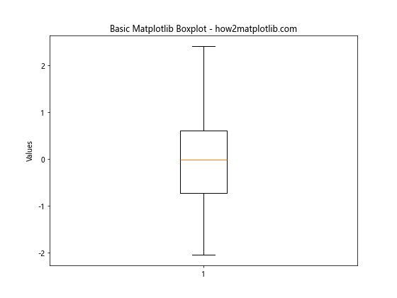
In this example, we generate random data and create a basic box plot using matplotlib boxplot. The resulting plot shows the median (central line), the interquartile range (box), and the whiskers extending to the minimum and maximum values within 1.5 times the interquartile range.
Customizing Matplotlib Boxplot Appearance
Matplotlib boxplot offers numerous options for customizing the appearance of your box plots. You can adjust colors, line styles, and other visual elements to create more appealing and informative visualizations. Here’s an example demonstrating some customization options:
import matplotlib.pyplot as plt
import numpy as np # Generate sample data
data = [np.random.normal(0, std, 100) for std in range(1, 4)] # Create a customized box plot
fig, ax = plt.subplots(figsize=(10, 6))
bp = ax.boxplot(data, patch_artist=True)
# Customize colors
colors = ['lightblue', 'lightgreen', 'lightpink']
for patch, color in zip(bp['boxes'], colors):
    patch.set_facecolor(color)
# Customize other elements
plt.title('Customized Matplotlib Boxplot - how2matplotlib.com')
plt.xlabel('Groups')
plt.ylabel('Values')
ax.set_xticklabels(['Group A', 'Group B', 'Group C'])
plt.show()
Output:
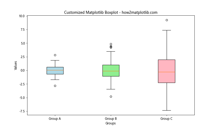
This example demonstrates how to customize the fill color of the boxes, set labels for the x-axis, and adjust other visual elements of the matplotlib boxplot.
Creating Multiple Box Plots with Matplotlib
Matplotlib boxplot allows you to create multiple box plots side by side, which is useful for comparing distributions across different categories or groups. Here’s an example of how to create multiple box plots:
import matplotlib.pyplot as plt
import numpy as np
# Generate sample data for multiple groups
data = [np.random.normal(0, std, 100) for std in range(1, 5)]
# Create multiple box plots
plt.figure(figsize=(12, 6))
plt.boxplot(data)
plt.title('Multiple Box Plots with Matplotlib - how2matplotlib.com')
plt.xlabel('Groups')
plt.ylabel('Values')
plt.xticks([1, 2, 3, 4], ['A', 'B', 'C', 'D'])
plt.show()
Output:
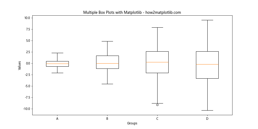
This example creates four box plots side by side, allowing for easy comparison of the distributions across different groups.
Adding Notches to Matplotlib Boxplot
Notches in a box plot can provide a visual cue for comparing medians across different groups. Matplotlib boxplot supports adding notches to your plots. Here’s how you can create a box plot with notches:
import matplotlib.pyplot as plt
import numpy as np
# Generate sample data
data = [np.random.normal(0, std, 100) for std in range(1, 4)]
# Create a box plot with notches
plt.figure(figsize=(10, 6))
plt.boxplot(data, notch=True)
plt.title('Matplotlib Boxplot with Notches - how2matplotlib.com')
plt.xlabel('Groups')
plt.ylabel('Values')
plt.xticks([1, 2, 3], ['A', 'B', 'C'])
plt.show()
Output:
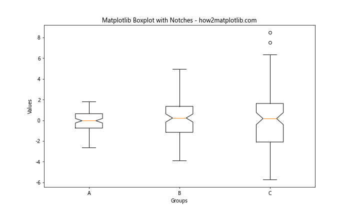
In this example, we set notch=True in the matplotlib boxplot function to add notches to the boxes. These notches represent the confidence interval around the median.
Handling Outliers in Matplotlib Boxplot
Outliers are an important aspect of data distribution, and matplotlib boxplot provides options for handling and displaying outliers. Here’s an example that demonstrates different ways to handle outliers:
import matplotlib.pyplot as plt
import numpy as np # Generate sample data with outliers
np.random.seed(42)
data = np.random.normal(100, 20, 200)
outliers = np.random.uniform(50, 150, 10)
data = np.concatenate([data, outliers]) # Create box plots with different outlier styles
fig, (ax1, ax2) = plt.subplots(1, 2, figsize=(12, 6))
# Default outlier style
ax1.boxplot(data)
ax1.set_title('Default Outliers - how2matplotlib.com')
# Custom outlier style
ax2.boxplot(data, flierprops={'marker': 'o', 'markerfacecolor': 'red', 'markersize': 8})
ax2.set_title('Custom Outliers - how2matplotlib.com')
plt.tight_layout()
plt.show()
Output:
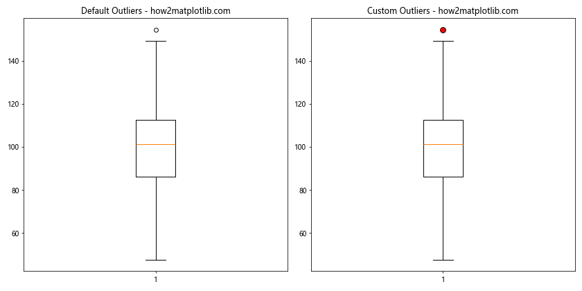
This example shows two box plots: one with the default outlier style and another with customized outlier markers. You can adjust the appearance of outliers using the flierprops parameter in matplotlib boxplot.
Creating Horizontal Box Plots with Matplotlib
While vertical box plots are common, matplotlib boxplot also supports creating horizontal box plots. These can be useful when dealing with long category names or when you want to emphasize the distribution along the x-axis. Here’s how to create a horizontal box plot:
import matplotlib.pyplot as plt
import numpy as np
# Generate sample data
data = [np.random.normal(0, std, 100) for std in range(1, 5)]
# Create a horizontal box plot
plt.figure(figsize=(10, 6))
plt.boxplot(data, vert=False)
plt.title('Horizontal Matplotlib Boxplot - how2matplotlib.com')
plt.xlabel('Values')
plt.ylabel('Groups')
plt.yticks([1, 2, 3, 4], ['A', 'B', 'C', 'D'])
plt.show()
Output:
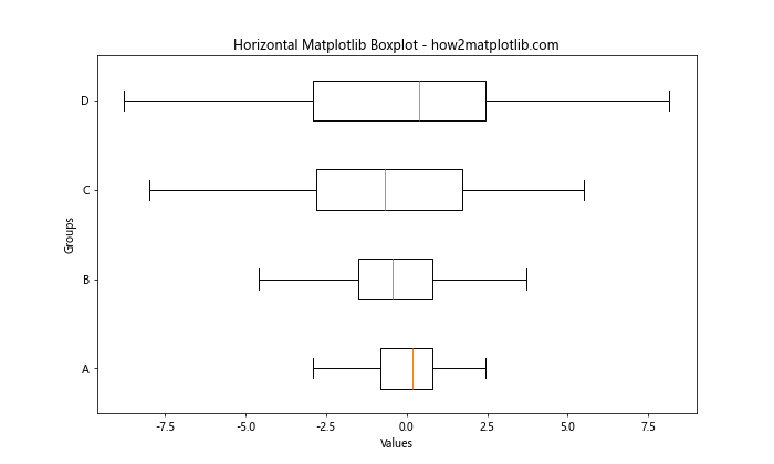
In this example, we set vert=False in the matplotlib boxplot function to create a horizontal box plot. Note that we’ve also swapped the x and y labels to reflect the change in orientation.
Adding Jittered Points to Matplotlib Boxplot
To provide more insight into the underlying data distribution, you can add jittered points to your matplotlib boxplot. This technique is particularly useful for smaller datasets. Here’s an example of how to add jittered points to a box plot:
import matplotlib.pyplot as plt
import numpy as np # Generate sample data
np.random.seed(42)
data = [np.random.normal(0, std, 30) for std in range(1, 4)] # Create a box plot with jittered points
fig, ax = plt.subplots(figsize=(10, 6))
bp = ax.boxplot(data)
colors = ['blue', 'green', 'red']
for i, d in enumerate(data):
    y = d
    x = np.random.normal(i+1, 0.04, len(y))
    ax.scatter(x, y, c=colors[i], alpha=0.4)
plt.title('Matplotlib Boxplot with Jittered Points - how2matplotlib.com')
plt.xlabel('Groups')
plt.ylabel('Values')
ax.set_xticklabels(['A', 'B', 'C'])
plt.show()
Output:
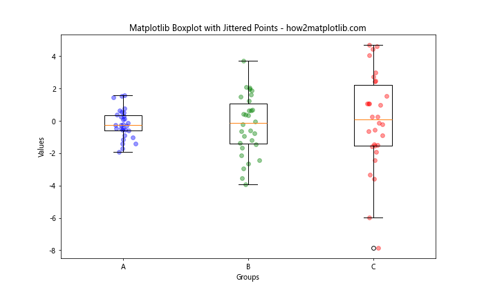
This example adds jittered points to each box in the plot, providing a more detailed view of the data distribution within each group.
Creating Violin Plots with Matplotlib
While not strictly a box plot, violin plots are closely related and can be created using matplotlib. Violin plots combine aspects of box plots and kernel density estimates. Here’s how to create a violin plot using matplotlib:
import matplotlib.pyplot as plt
import numpy as np
# Generate sample data
np.random.seed(10)
data = [np.random.normal(0, std, 100) for std in range(1, 5)]
# Create a violin plot
plt.figure(figsize=(10, 6))
plt.violinplot(data)
plt.title('Violin Plot using Matplotlib - how2matplotlib.com')
plt.xlabel('Groups')
plt.ylabel('Values')
plt.xticks([1, 2, 3, 4], ['A', 'B', 'C', 'D'])
plt.show()
Output:
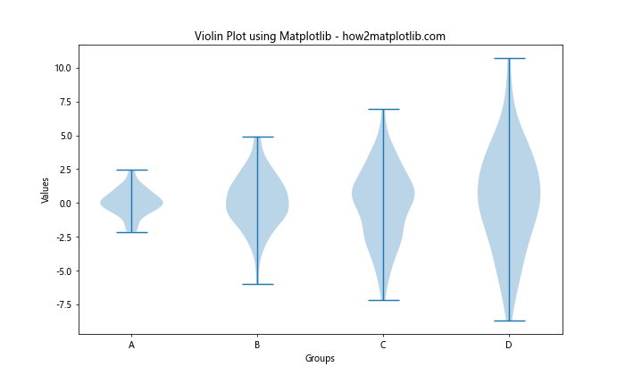
This example creates a violin plot, which provides a more detailed view of the data distribution compared to a standard box plot.
Combining Box Plots and Violin Plots
For a comprehensive view of your data, you can combine box plots and violin plots using matplotlib. This approach allows you to see both the summary statistics provided by box plots and the full distribution shown by violin plots. Here’s an example:
import matplotlib.pyplot as plt
import numpy as np # Generate sample data
np.random.seed(42)
data = [np.random.normal(0, std, 100) for std in range(1, 4)] # Create a figure with box plots and violin plots
fig, (ax1, ax2) = plt.subplots(nrows=1, ncols=2, figsize=(12, 6))
# Box plot
ax1.boxplot(data)
ax1.set_title('Box Plot - how2matplotlib.com')
ax1.set_xlabel('Groups')
ax1.set_ylabel('Values')
# Violin plot
ax2.violinplot(data)
ax2.set_title('Violin Plot - how2matplotlib.com')
ax2.set_xlabel('Groups')
ax2.set_ylabel('Values')
# Set consistent x-axis labels
for ax in [ax1, ax2]:
    ax.set_xticks([1, 2, 3])
    ax.set_xticklabels(['A', 'B', 'C'])
plt.tight_layout()
plt.show()
Output:
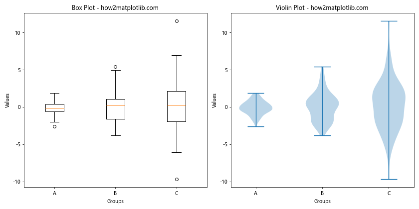
This example creates side-by-side box and violin plots, allowing for easy comparison between the two visualization techniques.
Creating Grouped Box Plots with Matplotlib
When dealing with multiple categories and groups, creating grouped box plots can be very informative. Matplotlib boxplot supports this functionality. Here’s an example of how to create grouped box plots:
import matplotlib.pyplot as plt
import numpy as np # Generate sample data
np.random.seed(42)
data = { 'Group 1': [np.random.normal(0, std, 100) for std in range(1, 4)], 'Group 2': [np.random.normal(0, std, 100) for std in range(2, 5)]
} # Create grouped box plots
fig, ax = plt.subplots(figsize=(12, 6))
positions = [[1, 2, 3], [4, 5, 6]]
colors = ['lightblue', 'lightgreen']
for i, (group, group_data) in enumerate(data.items()):
    bp = ax.boxplot(group_data, positions=positions[i], patch_artist=True)
    for patch in bp['boxes']:
        patch.set_facecolor(colors[i])
plt.title('Grouped Box Plots with Matplotlib - how2matplotlib.com')
plt.xlabel('Subgroups')
plt.ylabel('Values')
ax.set_xticks([2, 5])
ax.set_xticklabels(['Group 1', 'Group 2'])
plt.show()
Output:
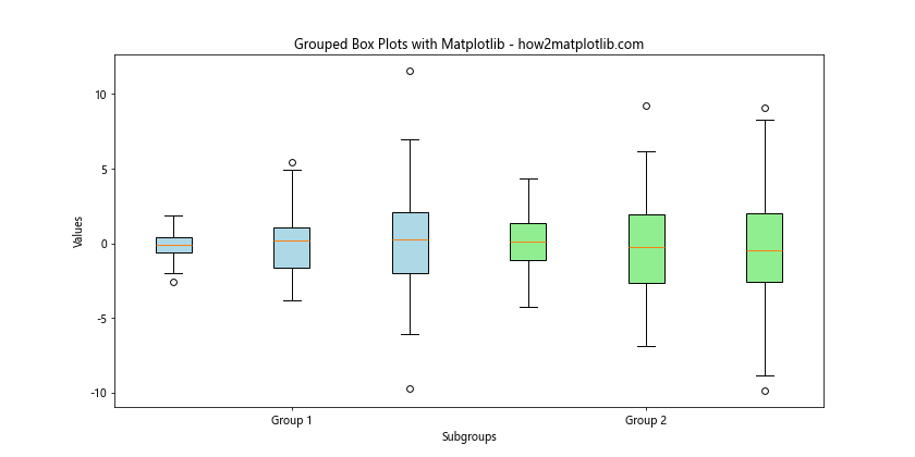
This example creates two groups of box plots, each containing three subgroups. The groups are differentiated by color and position.
Adding Statistical Annotations to Matplotlib Boxplot
To provide more statistical context to your box plots, you can add annotations showing key statistics. Here’s an example of how to add mean values and sample sizes to your matplotlib boxplot:
import matplotlib.pyplot as plt
import numpy as np
# Generate sample data
np.random.seed(42)
data = [np.random.normal(0, std, 100) for std in range(1, 4)]
# Create a box plot with annotations
fig, ax = plt.subplots(figsize=(10, 6))
bp = ax.boxplot(data)
ax.set_xticklabels(['A', 'B', 'C'])
# Add mean values
means = [np.mean(d) for d in data]
pos = range(len(data))
for i in range(len(data)):
    ax.text(pos[i]+1, means[i], f'Mean: {means[i]:.2f}',
            horizontalalignment='center', verticalalignment='bottom')
# Add sample sizes
for i, d in enumerate(data):
    ax.text(i+1, ax.get_ylim()[0], f'n={len(d)}',
            horizontalalignment='center', verticalalignment='top')
plt.title('Matplotlib Boxplot with Statistical Annotations - how2matplotlib.com')
plt.xlabel('Groups')
plt.ylabel('Values')
plt.show()
Output:
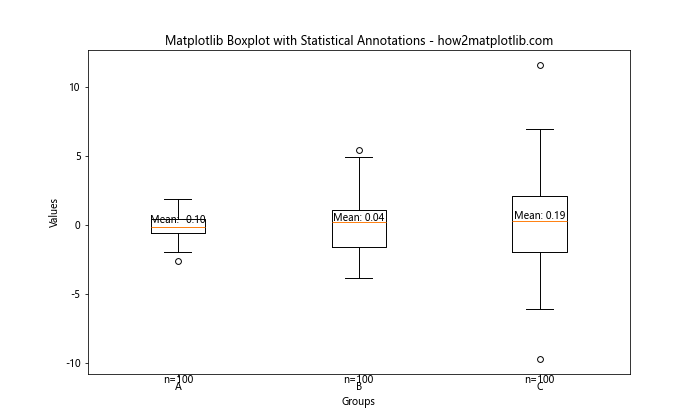
This example adds annotations for the mean values above each box and the sample sizes below each box in the matplotlib boxplot.
Creating Box Plots with Subplots
When dealing with multiple datasets or categories, it can be useful to create separate box plots as subplots. Matplotlib boxplot can be easily integrated into a subplot layout. Here’s an example:
import matplotlib.pyplot as plt
import numpy as np
# Generate sample data
np.random.seed(42)
data1 = [np.random.normal(0, std, 100) for std in range(1, 4)]
data2 = [np.random.normal(0, std, 100) for std in range(2, 5)]
# Create box plots as subplots
fig, (ax1, ax2) = plt.subplots(1, 2, figsize=(12, 6))
ax1.boxplot(data1)
ax1.set_title('Dataset 1 - how2matplotlib.com')
ax1.set_xlabel('Groups')
ax1.set_ylabel('Values')
ax1.set_xticklabels(['A', 'B', 'C'])
ax2.boxplot(data2)
ax2.set_title('Dataset 2 - how2matplotlib.com')
ax2.set_xlabel('Groups')
ax2.set_ylabel('Values')
ax2.set_xticklabels(['X', 'Y', 'Z'])
plt.tight_layout()
plt.show()
Output:
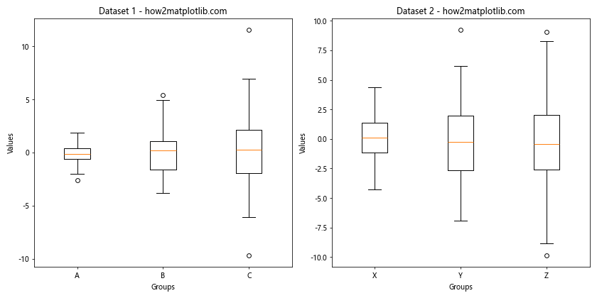
This example creates two separate box plots as subplots, allowing for easy comparison between two different datasets or categories.
Customizing Matplotlib Boxplot Whiskers
The whiskers in a box plot typically extend to 1.5 times the interquartile range, but matplotlib boxplot allows you to customize this behavior. Here’s an example showing different whisker styles:
import matplotlib.pyplot as plt
import numpy as np
# Generate sample data
np.random.seed(42)
data = [np.random.normal(0, std, 100) for std in range(1, 4)]
# Create box plots with different whisker styles
fig, (ax1, ax2) = plt.subplots(1, 2, figsize=(12, 6))
ax1.boxplot(data, whis=1.5)
ax1.set_title('Default Whiskers (1.5 IQR) - how2matplotlib.com')
ax1.set_xlabel('Groups')
ax1.set_ylabel('Values')
ax2.boxplot(data, whis=[5, 95])
ax2.set_title('CustomWhiskers (5th-95th percentile) - how2matplotlib.com')
ax2.set_xlabel('Groups')
ax2.set_ylabel('Values')
plt.tight_layout()
plt.show()
Output:
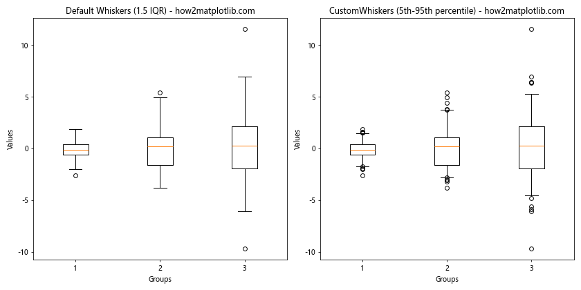
This example demonstrates two different whisker styles: the default 1.5 times IQR and a custom style showing the 5th to 95th percentile range.
Adding a Legend to Matplotlib Boxplot
When creating multiple box plots or using different colors, adding a legend can help clarify the meaning of each element. Here’s how to add a legend to your matplotlib boxplot:
import matplotlib.pyplot as plt
import numpy as np
# Generate sample data
np.random.seed(42)
data = [np.random.normal(0, std, 100) for std in range(1, 4)]
# Create a box plot with a legend
fig, ax = plt.subplots(figsize=(10, 6))
bp = ax.boxplot(data, patch_artist=True)
colors = ['lightblue', 'lightgreen', 'lightpink']
for patch, color in zip(bp['boxes'], colors):
    patch.set_facecolor(color)
plt.title('Matplotlib Boxplot with Legend - how2matplotlib.com')
plt.xlabel('Groups')
plt.ylabel('Values')
# Create legend
legend_elements = [plt.Rectangle((0,0),1,1, facecolor=c, edgecolor='black') for c in colors]
plt.legend(legend_elements, ['Group A', 'Group B', 'Group C'], loc='upper right')
plt.show()
Output:
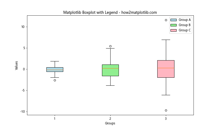
This example creates a box plot with different colored boxes and adds a legend to explain what each color represents.
Creating Box Plots from Pandas DataFrame
Matplotlib boxplot integrates well with pandas DataFrames, making it easy to create box plots from structured data. Here’s an example of how to create a box plot from a pandas DataFrame:
import matplotlib.pyplot as plt
import pandas as pd
import numpy as np
# Create a sample DataFrame
np.random.seed(42)
df = pd.DataFrame({
    'Group A': np.random.normal(0, 1, 100),
    'Group B': np.random.normal(1, 1.5, 100),
    'Group C': np.random.normal(2, 2, 100)
})
# Create a box plot from the DataFrame
plt.figure(figsize=(10, 6))
df.boxplot(column=['Group A', 'Group B', 'Group C'])
plt.title('Box Plot from Pandas DataFrame - how2matplotlib.com')
plt.ylabel('Values')
plt.show()
Output:
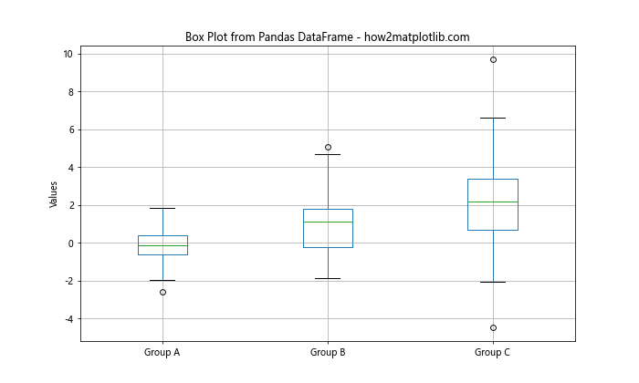
This example demonstrates how to create a box plot directly from a pandas DataFrame using matplotlib boxplot functionality.
Customizing Box Plot Fill Colors and Transparency
Matplotlib boxplot allows for extensive customization of the visual elements, including fill colors and transparency. Here’s an example showing how to customize these aspects:
import matplotlib.pyplot as plt
import numpy as np
# Generate sample data
np.random.seed(42)
data = [np.random.normal(0, std, 100) for std in range(1, 4)]
# Create a customized box plot
fig, ax = plt.subplots(figsize=(10, 6))
bp = ax.boxplot(data, patch_artist=True)
colors = ['lightblue', 'lightgreen', 'lightpink']
alphas = [1.0, 0.7, 0.4]
for patch, color, alpha in zip(bp['boxes'], colors, alphas):
    patch.set_facecolor(color)
    patch.set_alpha(alpha)
plt.title('Customized Fill Colors and Transparency - how2matplotlib.com')
plt.xlabel('Groups')
plt.ylabel('Values')
ax.set_xticklabels(['A', 'B', 'C'])
plt.show()
Output:
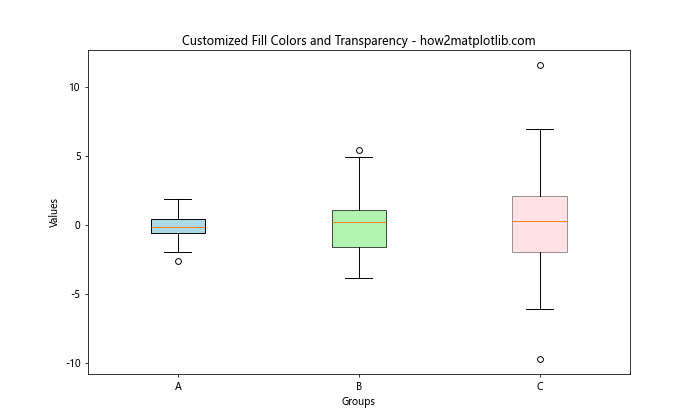
This example demonstrates how to set different fill colors and transparency levels for each box in the matplotlib boxplot.
Creating Comparative Box Plots
Matplotlib boxplot can be used to create comparative visualizations, allowing you to easily compare distributions across different categories or time periods. Here’s an example of how to create a comparative box plot:
import matplotlib.pyplot as plt
import numpy as np
# Generate sample data
np.random.seed(42)
before = [np.random.normal(0, std, 100) for std in range(1, 4)]
after = [np.random.normal(0.5, std, 100) for std in range(1, 4)]
# Create comparative box plots
fig, ax = plt.subplots(figsize=(12, 6))
bp1 = ax.boxplot(before, positions=np.array(range(len(before)))*2.0-0.4, widths=0.6)
bp2 = ax.boxplot(after, positions=np.array(range(len(after)))*2.0+0.4, widths=0.6)
# Customize colors
for bp in [bp1, bp2]:
    for box in bp['boxes']:
        box.set(color='blue' if bp == bp1 else 'red', linewidth=2)
    for whisker in bp['whiskers']:
        whisker.set(color='blue' if bp == bp1 else 'red', linewidth=2)
    for cap in bp['caps']:
        cap.set(color='blue' if bp == bp1 else 'red', linewidth=2)
    for median in bp['medians']:
        median.set(color='blue' if bp == bp1 else 'red', linewidth=2)
plt.title('Comparative Box Plots - how2matplotlib.com')
plt.xlabel('Groups')
plt.ylabel('Values')
ax.set_xticks(range(0, len(before) * 2, 2))
ax.set_xticklabels(['A', 'B', 'C'])
ax.legend([bp1["boxes"][0], bp2["boxes"][0]], ['Before', 'After'], loc='upper left')
plt.show()
Output:
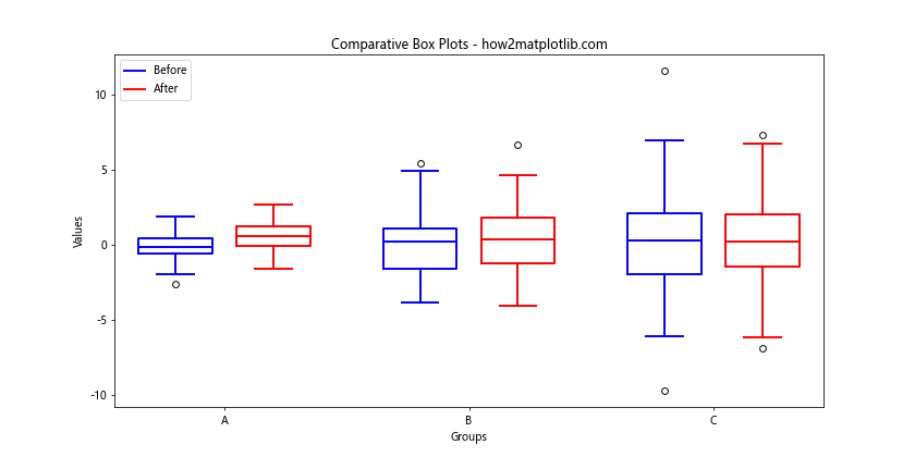
This example creates side-by-side box plots to compare ‘before’ and ‘after’ scenarios across three different groups.
Matplotlib boxplot Conclusion
Matplotlib boxplot is a versatile and powerful tool for visualizing data distributions. From basic box plots to advanced customizations and comparative visualizations, matplotlib provides a wide range of options to create informative and visually appealing box plots. By mastering these techniques, you can effectively communicate complex data patterns and distributions in your data analysis and research projects.
Remember that the key to creating effective visualizations with matplotlib boxplot is to understand your data and choose the appropriate customizations that best highlight the important aspects of your distributions. Experiment with different styles, colors, and annotations to find the most effective way to present your data.