Matplotlib xticks are an essential component of data visualization in Python. Understanding how to manipulate and customize xticks can significantly enhance the clarity and effectiveness of your plots. This comprehensive guide will delve deep into the world of matplotlib xticks, providing you with the knowledge and skills to create professional-looking charts and graphs.
Matplotlib Xticks Recommended Articles
Introduction to Matplotlib Xticks
Matplotlib xticks refer to the tick marks and labels along the x-axis of a plot. These elements play a crucial role in conveying information about the data points’ positions and values. Proper use of matplotlib xticks can greatly improve the readability and interpretability of your visualizations.
Let’s start with a simple example to illustrate the basic usage of matplotlib xticks:
import matplotlib.pyplot as plt
import numpy as np
x = np.arange(5)
y = [2, 4, 1, 5, 3]
plt.plot(x, y)
plt.xticks(x, ['A', 'B', 'C', 'D', 'E'])
plt.title('Basic Matplotlib Xticks Example - how2matplotlib.com')
plt.show()
Output:
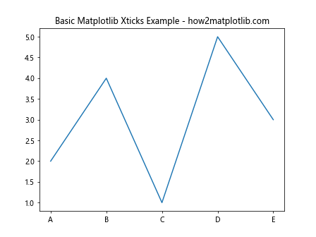
In this example, we’ve created a simple line plot and used matplotlib xticks to replace the default numeric labels with custom text labels. The plt.xticks() function is used to set both the positions and labels of the xticks.
Customizing Matplotlib Xticks
Matplotlib offers a wide range of options for customizing xticks. You can adjust their position, rotation, font size, color, and more. Let’s explore some of these customization options:
Rotating Matplotlib Xticks
When dealing with long labels or many xticks, rotating them can prevent overlapping and improve readability:
import matplotlib.pyplot as plt
import numpy as np
x = np.arange(10)
y = np.random.rand(10)
plt.plot(x, y)
plt.xticks(x, ['Long Label ' + str(i) for i in x], rotation=45, ha='right')
plt.title('Rotated Matplotlib Xticks - how2matplotlib.com')
plt.tight_layout()
plt.show()
Output:
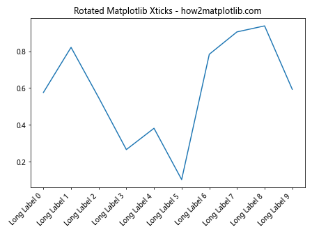
In this example, we’ve rotated the matplotlib xticks by 45 degrees and aligned them to the right using the ha='right' parameter. The tight_layout() function is used to prevent the labels from being cut off.
Formatting Matplotlib Xticks
You can format the appearance of matplotlib xticks using various parameters:
import matplotlib.pyplot as plt
import numpy as np
x = np.linspace(0, 2*np.pi, 10)
y = np.sin(x)
plt.plot(x, y)
plt.xticks(x, fontsize=12, color='red', fontweight='bold')
plt.title('Formatted Matplotlib Xticks - how2matplotlib.com')
plt.show()
Output:
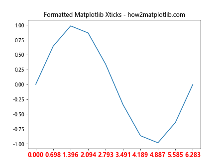
This example demonstrates how to change the font size, color, and weight of matplotlib xticks. You can further customize the appearance using other font properties available in matplotlib.
Setting Matplotlib Xticks Frequency
Sometimes, you may want to display only a subset of xticks to reduce clutter:
import matplotlib.pyplot as plt
import numpy as np
x = np.arange(0, 100, 2)
y = np.random.rand(50)
plt.plot(x, y)
plt.xticks(np.arange(0, 101, 10))
plt.title('Matplotlib Xticks Frequency Example - how2matplotlib.com')
plt.show()
Output:
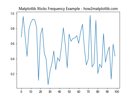
In this example, we’ve set the matplotlib xticks to appear at intervals of 10, even though our data points are at intervals of 2.
Advanced Matplotlib Xticks Techniques
Now that we’ve covered the basics, let’s explore some more advanced techniques for working with matplotlib xticks.
Using Date Locators and Formatters
When working with time-series data, matplotlib provides special locators and formatters for xticks:
import matplotlib.pyplot as plt
import matplotlib.dates as mdates
import numpy as np
from datetime import datetime, timedelta
start_date = datetime(2023, 1, 1)
dates = [start_date + timedelta(days=i) for i in range(100)]
y = np.random.rand(100)
plt.figure(figsize=(12, 6))
plt.plot(dates, y)
plt.gca().xaxis.set_major_locator(mdates.MonthLocator())
plt.gca().xaxis.set_major_formatter(mdates.DateFormatter('%b %Y'))
plt.xticks(rotation=45)
plt.title('Matplotlib Xticks with Date Locators and Formatters - how2matplotlib.com')
plt.tight_layout()
plt.show()
Output:
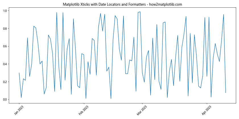
This example demonstrates how to use date locators and formatters to create meaningful xticks for time-series data. The MonthLocator places ticks at the start of each month, while the DateFormatter formats the labels as abbreviated month and year.
Multiple X-axes with Different Xticks
In some cases, you might want to display multiple x-axes with different xticks:
import matplotlib.pyplot as plt
import numpy as np x = np.linspace(0, 10, 100)
y1 = np.sin(x)
y2 = np.cos(x) fig, ax1 = plt.subplots()
ax1.plot(x, y1, 'b-', label='sin(x)')
ax1.set_xlabel('X - how2matplotlib.com')
ax1.set_ylabel('sin(x)', color='b')
ax1.tick_params(axis='y', labelcolor='b')
ax2 = ax1.twiny()
ax2.plot(x, y2, 'r-', label='cos(x)')
ax2.set_xlabel('X (scaled) - how2matplotlib.com')
ax2.set_ylabel('cos(x)', color='r')
ax2.tick_params(axis='y', labelcolor='r')
ax2.set_xticks(np.linspace(0, 10, 6))
ax2.set_xticklabels([f'{i:.1f}' for i in np.linspace(0, 1, 6)])
plt.title('Multiple X-axes with Different Matplotlib Xticks')
plt.tight_layout()
plt.show()
Output:
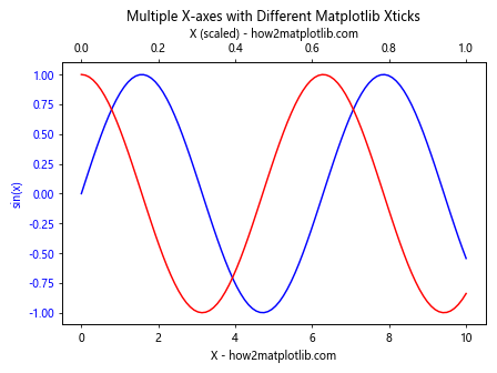
This example creates two x-axes with different xticks. The primary x-axis uses the original scale, while the secondary x-axis (created using twiny()) uses a scaled version of the x-values.
Logarithmic Xticks
For data that spans multiple orders of magnitude, logarithmic xticks can be useful:
import matplotlib.pyplot as plt
import numpy as np
x = np.logspace(0, 5, 100)
y = x**2
plt.figure(figsize=(10, 6))
plt.semilogx(x, y)
plt.xticks([1, 10, 100, 1000, 10000, 100000], ['1', '10', '100', '1K', '10K', '100K'])
plt.title('Logarithmic Matplotlib Xticks - how2matplotlib.com')
plt.xlabel('X (log scale)')
plt.ylabel('Y')
plt.grid(True)
plt.show()
Output:
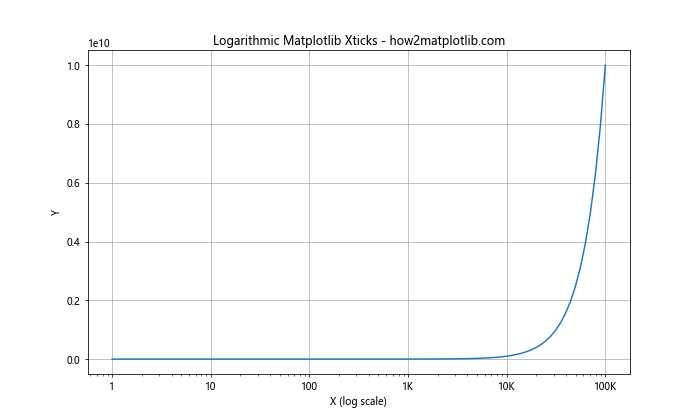
This example uses semilogx() to create a plot with a logarithmic x-axis. We then customize the matplotlib xticks to use more readable labels for the logarithmic scale.
Handling Overlapping Matplotlib Xticks
When dealing with many data points or long labels, xticks can often overlap, making the plot difficult to read. Here are some strategies to handle overlapping matplotlib xticks:
Using TickLocator
Matplotlib provides various TickLocator classes that can help reduce the number of xticks displayed:
import matplotlib.pyplot as plt
import numpy as np
from matplotlib.ticker import MaxNLocator
x = np.arange(50)
y = np.random.rand(50)
plt.figure(figsize=(12, 6))
plt.plot(x, y)
ax = plt.gca()
ax.xaxis.set_major_locator(MaxNLocator(nbins=10))
plt.title('Matplotlib Xticks with MaxNLocator - how2matplotlib.com')
plt.xlabel('X')
plt.ylabel('Y')
plt.show()
Output:
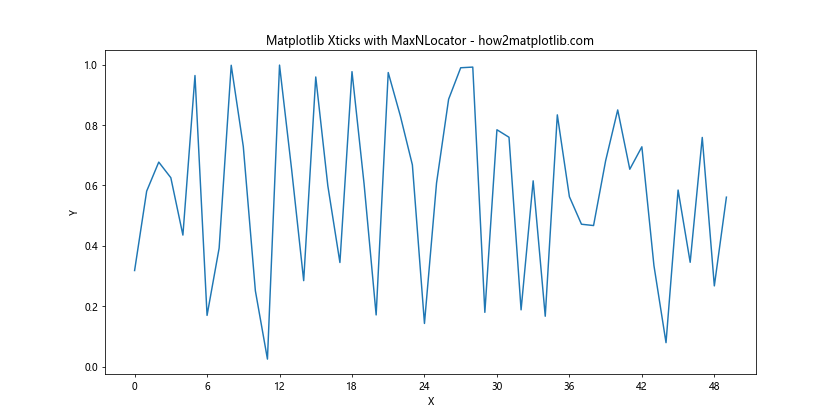
In this example, we use the MaxNLocator to limit the number of xticks to approximately 10, reducing overlap.
Staggering Xticks
For categorical data with long labels, staggering the xticks can be an effective solution:
import matplotlib.pyplot as plt
import numpy as np categories = [f'Category {i} - how2matplotlib.com' for i in range(20)]
values = np.random.rand(20) fig, ax = plt.subplots(figsize=(12, 6))
ax.bar(categories, values)
plt.xticks(range(len(categories)), categories, rotation=45, ha='right')
ax.set_xticks(ax.get_xticks()[::2])
ax.set_xticklabels(ax.get_xticklabels()[::2])
ax.tick_params(axis='x', which='minor', bottom=False)
plt.title('Staggered Matplotlib Xticks')
plt.tight_layout()
plt.show()
This example creates a bar plot with long category names and then removes every other xtick to create a staggered effect, reducing overlap.
Customizing Matplotlib Xticks Appearance
Matplotlib offers extensive options for customizing the appearance of xticks. Let’s explore some of these options:
Changing Xticks Color and Style
You can change the color and style of matplotlib xticks to match your plot’s theme:
import matplotlib.pyplot as plt
import numpy as np
x = np.linspace(0, 10, 100)
y = np.sin(x)
plt.figure(figsize=(10, 6))
plt.plot(x, y)
plt.xticks(color='red', size=12)
plt.tick_params(axis='x', which='major', direction='inout', length=10, width=2, color='blue')
plt.title('Customized Matplotlib Xticks Appearance - how2matplotlib.com')
plt.show()
Output:
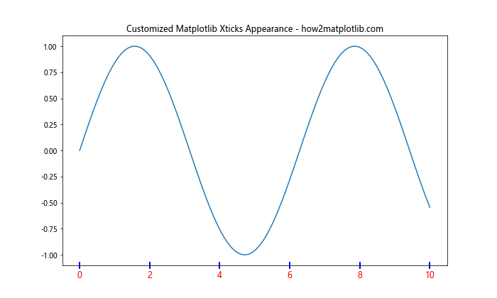
This example changes the color and size of the xtick labels and customizes the appearance of the tick marks themselves.
Using LaTeX for Xtick Labels
For mathematical expressions or complex symbols, you can use LaTeX in your xtick labels:
import matplotlib.pyplot as plt
import numpy as np
plt.rcParams['text.usetex'] = True
plt.rcParams['font.family'] = 'serif'
x = np.linspace(0, 2*np.pi, 5)
y = np.sin(x)
plt.figure(figsize=(10, 6))
plt.plot(x, y)
plt.xticks(x, [r'$0$', r'$\frac{\pi}{2}$', r'$\pi$', r'$\frac{3\pi}{2}$', r'$2\pi$'])
plt.title(r'Matplotlib Xticks with LaTeX - $\sin(x)$ - how2matplotlib.com')
plt.show()
This example uses LaTeX to create mathematically correct xtick labels for a sine wave plot.
Matplotlib Xticks in Different Plot Types
Different types of plots may require different approaches to handling xticks. Let’s look at some examples:
Xticks in Scatter Plots
In scatter plots, you might want to customize xticks based on the data distribution:
import matplotlib.pyplot as plt
import numpy as np
x = np.random.rand(100) * 100
y = np.random.rand(100) * 100
plt.figure(figsize=(10, 6))
plt.scatter(x, y)
plt.xticks(np.arange(0, 101, 10))
plt.grid(axis='x', linestyle='--', alpha=0.7)
plt.title('Matplotlib Xticks in Scatter Plot - how2matplotlib.com')
plt.xlabel('X')
plt.ylabel('Y')
plt.show()
Output:
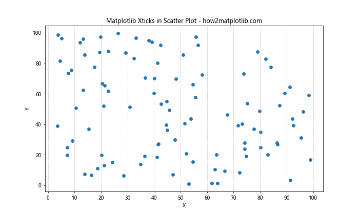
This example creates a scatter plot and sets xticks at regular intervals, adding a grid for better readability.
Xticks in Histograms
For histograms, you might want to align xticks with bin edges:
import matplotlib.pyplot as plt
import numpy as np data = np.random.normal(0, 1, 1000) plt.figure(figsize=(10, 6))
n, bins, patches = plt.hist(data, bins=20, edgecolor='black')
plt.xticks(bins)
plt.title('Matplotlib Xticks in Histogram - how2matplotlib.com')
plt.xlabel('Value')
plt.ylabel('Frequency')
plt.show()
Output:
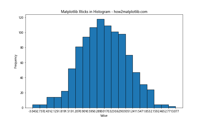
This example creates a histogram and sets the xticks to align with the bin edges.
Handling Missing Data and Matplotlib Xticks
When dealing with datasets that have missing values, you may need to adjust how matplotlib xticks are displayed:
import matplotlib.pyplot as plt
import numpy as np
import pandas as pd
dates = pd.date_range(start='2023-01-01', end='2023-12-31', freq='D')
values = np.random.rand(len(dates))
values[50:100] = np.nan  # Introduce missing data
df = pd.DataFrame({'date': dates, 'value': values})
df = df.dropna()  # Remove missing data
plt.figure(figsize=(12, 6))
plt.plot(df['date'], df['value'])
plt.gca().xaxis.set_major_locator(mdates.MonthLocator())
plt.gca().xaxis.set_major_formatter(mdates.DateFormatter('%b'))
plt.title('Matplotlib Xticks with Missing Data - how2matplotlib.com')
plt.xlabel('Month')
plt.ylabel('Value')
plt.xticks(rotation=45)
plt.tight_layout()
plt.show()
This example demonstrates how to handle matplotlib xticks when there are gaps in the data due to missing values.
Matplotlib Xticks in Subplots
When working with multiple subplots, you may want to customize xticks differently for each subplot:
import matplotlib.pyplot as plt
import numpy as np x = np.linspace(0, 10, 100)
y1 = np.sin(x)
y2 = np.cos(x) fig, (ax1, ax2) = plt.subplots(2, 1, figsize=(10, 8), sharex=True)
ax1.plot(x, y1)
ax1.set_title('Sine Wave - how2matplotlib.com')
ax1.set_xticks([])
ax2.plot(x, y2)
ax2.set_title('Cosine Wave - how2matplotlib.com')
ax2.set_xticks(np.arange(0, 11, 2))
plt.tight_layout()
plt.show()
Output:
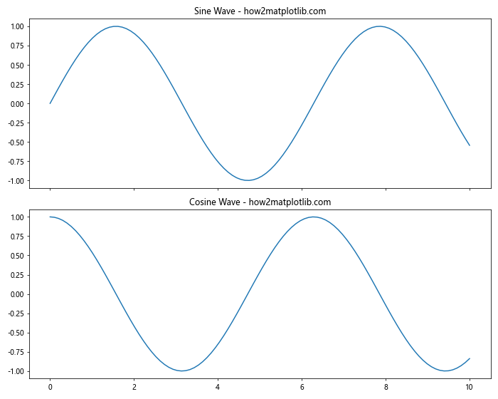
This example creates two subplots with different xticks settings. The top subplot has no xticks, while the bottom subplot has xticks at regular intervals.
Animating Matplotlib Xticks
For dynamic visualizations, you might want to animate the xticks:
import matplotlib.pyplot as plt
import matplotlib.animation as animation
import numpy as np fig, ax = plt.subplots()
x = np.linspace(0, 2*np.pi, 100)
line, = ax.plot(x, np.sin(x))
def animate(i):
    line.set_ydata(np.sin(x + i/10))
    ax.set_xticks(np.linspace(0, 2*np.pi, 5))
    ax继续输出剩余内容:
    ax.set_xticklabels([f'{(i/np.pi):.1f}π' for i in ax.get_xticks()])
    return line,
ani = animation.FuncAnimation(fig, animate, frames=100, interval=50, blit=True)
plt.title('Animated Matplotlib Xticks - how2matplotlib.com')
plt.show()
This example creates an animation where both the sine wave and the xticks are updated in each frame.
Matplotlib Xticks in 3D Plots
When working with 3D plots, you can customize xticks for each axis:
import matplotlib.pyplot as plt
import numpy as np
fig = plt.figure(figsize=(10, 8))
ax = fig.add_subplot(111, projection='3d')
x = np.arange(-5, 5, 0.25)
y = np.arange(-5, 5, 0.25)
X, Y = np.meshgrid(x, y)
Z = np.sin(np.sqrt(X**2 + Y**2))
surf = ax.plot_surface(X, Y, Z, cmap='viridis')
ax.set_xticks(np.arange(-5, 6, 2))
ax.set_yticks(np.arange(-5, 6, 2))
ax.set_zticks(np.arange(-1, 1.1, 0.5))
ax.set_xlabel('X - how2matplotlib.com')
ax.set_ylabel('Y - how2matplotlib.com')
ax.set_zlabel('Z - how2matplotlib.com')
plt.title('Matplotlib Xticks in 3D Plot')
plt.show()
Output:
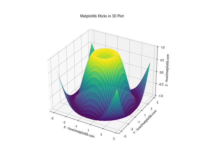
This example demonstrates how to set xticks for all three axes in a 3D surface plot.
Handling Large Datasets with Matplotlib Xticks
When dealing with large datasets, displaying all xticks can lead to clutter. Here’s an approach to handle this:
import matplotlib.pyplot as plt
import numpy as np np.random.seed(42)
x = np.arange(1000)
y = np.cumsum(np.random.randn(1000)) fig, ax = plt.subplots(figsize=(12, 6))
ax.plot(x, y)
# Set major ticks every 200 units
major_ticks = np.arange(0, 1001, 200)
ax.set_xticks(major_ticks)
# Set minor ticks every 50 units
minor_ticks = np.arange(0, 1001, 50)
ax.set_xticks(minor_ticks, minor=True)
ax.grid(which='minor', alpha=0.2)
ax.grid(which='major', alpha=0.5)
plt.title('Matplotlib Xticks with Large Dataset - how2matplotlib.com')
plt.xlabel('X')
plt.ylabel('Y')
plt.show()
Output:
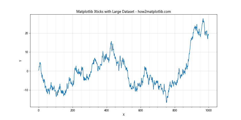
This example uses major and minor xticks to provide different levels of detail for a large dataset.
Matplotlib Xticks in Polar Plots
Polar plots require a different approach to xticks:
import matplotlib.pyplot as plt
import numpy as np
r = np.arange(0, 2, 0.01)
theta = 2 * np.pi * r
fig, ax = plt.subplots(subplot_kw=dict(projection='polar'))
ax.plot(theta, r)
ax.set_xticks(np.arange(0, 2*np.pi, np.pi/4))
ax.set_xticklabels(['0', 'π/4', 'π/2', '3π/4', 'π', '5π/4', '3π/2', '7π/4'])
plt.title('Matplotlib Xticks in Polar Plot - how2matplotlib.com')
plt.show()
Output:
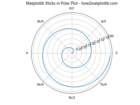
This example demonstrates how to set xticks in a polar plot, using radians as the unit.
Matplotlib xticks Conclusion
Mastering matplotlib xticks is crucial for creating clear, informative, and visually appealing data visualizations. This comprehensive guide has covered a wide range of techniques and scenarios for working with matplotlib xticks, from basic customization to advanced applications in various plot types.
By understanding how to manipulate xticks, you can significantly enhance the readability and effectiveness of your plots. Whether you’re working with time series data, categorical information, or complex mathematical functions, proper use of matplotlib xticks can help you convey your data’s story more effectively.
Remember that the key to great data visualization is clarity and purpose. Use these matplotlib xticks techniques judiciously, always keeping in mind the needs of your audience and the story you’re trying to tell with your data.