Matplotlib linestyle is a crucial aspect of data visualization in Python. This article will delve deep into the world of Matplotlib linestyle, exploring its various features, customization options, and best practices. Whether you’re a beginner or an experienced data scientist, this guide will help you harness the full power of Matplotlib linestyle to create stunning and informative visualizations.
Matplotlib Linestyle Recommended Articles
Understanding Matplotlib Linestyle Basics
Matplotlib linestyle refers to the appearance of lines in plots created using the Matplotlib library. It encompasses various attributes such as line type, color, width, and markers. By mastering Matplotlib linestyle, you can effectively communicate your data and make your visualizations more appealing and informative.
Let’s start with a simple example to illustrate the basic usage of Matplotlib linestyle:
import matplotlib.pyplot as plt
import numpy as np
x = np.linspace(0, 10, 100)
y = np.sin(x)
plt.plot(x, y, linestyle='-', label='how2matplotlib.com')
plt.title('Basic Matplotlib Linestyle Example')
plt.xlabel('X-axis')
plt.ylabel('Y-axis')
plt.legend()
plt.show()
Output:
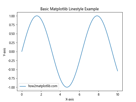
In this example, we use the default solid linestyle (‘-‘) to plot a sine wave. The linestyle parameter in the plot() function allows us to specify the desired line style.
Exploring Different Matplotlib Linestyle Options
Matplotlib offers a wide range of linestyle options to suit various visualization needs. Let’s explore some of the most commonly used linestyle options:
- Solid line (‘-‘)
- Dashed line (‘–‘)
- Dotted line (‘:’)
- Dash-dot line (‘-.’)
Here’s an example showcasing these different Matplotlib linestyle options:
import matplotlib.pyplot as plt
import numpy as np
x = np.linspace(0, 10, 100)
y1 = np.sin(x)
y2 = np.cos(x)
y3 = np.tan(x)
y4 = np.exp(-x/10)
plt.plot(x, y1, linestyle='-', label='Solid (how2matplotlib.com)')
plt.plot(x, y2, linestyle='--', label='Dashed')
plt.plot(x, y3, linestyle=':', label='Dotted')
plt.plot(x, y4, linestyle='-.', label='Dash-dot')
plt.title('Different Matplotlib Linestyle Options')
plt.xlabel('X-axis')
plt.ylabel('Y-axis')
plt.legend()
plt.show()
Output:
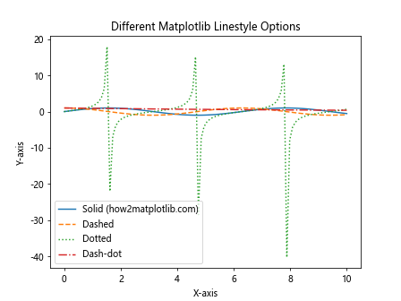
This example demonstrates how different linestyles can be used to distinguish between multiple lines in a single plot.
Customizing Matplotlib Linestyle Colors
Color is an essential aspect of Matplotlib linestyle customization. Matplotlib provides various ways to specify colors, including color names, hex codes, and RGB values.
Let’s explore color customization with Matplotlib linestyle:
import matplotlib.pyplot as plt
import numpy as np
x = np.linspace(0, 10, 100)
y = np.sin(x)
plt.plot(x, y, linestyle='-', color='red', label='Red (how2matplotlib.com)')
plt.plot(x, y + 1, linestyle='--', color='#00FF00', label='Green (hex)')
plt.plot(x, y - 1, linestyle=':', color=(0, 0, 1), label='Blue (RGB)')
plt.title('Matplotlib Linestyle Color Customization')
plt.xlabel('X-axis')
plt.ylabel('Y-axis')
plt.legend()
plt.show()
Output:
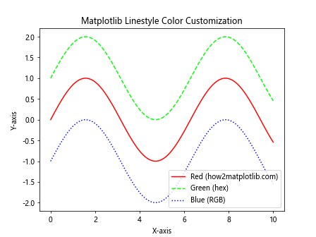
In this example, we use different methods to specify colors for each line: color name (‘red’), hex code (‘#00FF00’), and RGB tuple ((0, 0, 1)).
Adjusting Matplotlib Linestyle Width
Line width is another important aspect of Matplotlib linestyle that can greatly impact the visual appeal of your plots. You can easily adjust the line width using the linewidth or lw parameter.
Here’s an example demonstrating different line widths:
import matplotlib.pyplot as plt
import numpy as np
x = np.linspace(0, 10, 100)
y = np.sin(x)
plt.plot(x, y, linestyle='-', linewidth=1, label='1px (how2matplotlib.com)')
plt.plot(x, y + 0.5, linestyle='--', linewidth=2, label='2px')
plt.plot(x, y - 0.5, linestyle=':', linewidth=4, label='4px')
plt.title('Matplotlib Linestyle Width Customization')
plt.xlabel('X-axis')
plt.ylabel('Y-axis')
plt.legend()
plt.show()
Output:
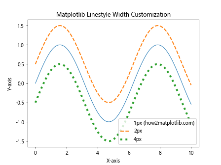
This example shows how different line widths can be used to emphasize certain lines or create a visual hierarchy in your plots.
Adding Markers to Matplotlib Linestyle
Markers are visual elements that can be added to data points along a line to highlight specific values or make the data more readable. Matplotlib offers a wide variety of marker styles that can be combined with different linestyles.
Let’s explore some marker options with Matplotlib linestyle:
import matplotlib.pyplot as plt
import numpy as np
x = np.linspace(0, 10, 20)
y = np.sin(x)
plt.plot(x, y, linestyle='-', marker='o', label='Circle (how2matplotlib.com)')
plt.plot(x, y + 0.5, linestyle='--', marker='s', label='Square')
plt.plot(x, y - 0.5, linestyle=':', marker='^', label='Triangle')
plt.title('Matplotlib Linestyle with Markers')
plt.xlabel('X-axis')
plt.ylabel('Y-axis')
plt.legend()
plt.show()
Output:
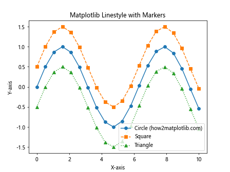
This example demonstrates how different marker styles can be combined with various linestyles to create more informative plots.
Creating Custom Matplotlib Linestyle Patterns
While Matplotlib provides several built-in linestyle options, you can also create custom linestyle patterns using a sequence of on/off ink specifications.
Here’s an example of creating custom Matplotlib linestyle patterns:
import matplotlib.pyplot as plt
import numpy as np
x = np.linspace(0, 10, 100)
y = np.sin(x)
plt.plot(x, y, linestyle=(0, (5, 5)), label='Custom 1 (how2matplotlib.com)')
plt.plot(x, y + 0.5, linestyle=(0, (5, 1)), label='Custom 2')
plt.plot(x, y - 0.5, linestyle=(0, (1, 1, 3, 1)), label='Custom 3')
plt.title('Custom Matplotlib Linestyle Patterns')
plt.xlabel('X-axis')
plt.ylabel('Y-axis')
plt.legend()
plt.show()
Output:
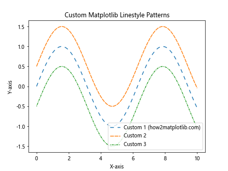
In this example, we create three custom linestyle patterns using tuples that specify the on/off ink sequence.
Combining Multiple Matplotlib Linestyle Properties
To create truly unique and informative visualizations, you can combine various Matplotlib linestyle properties such as color, width, markers, and custom patterns.
Let’s see an example that combines multiple Matplotlib linestyle properties:
import matplotlib.pyplot as plt
import numpy as np
x = np.linspace(0, 10, 50)
y = np.sin(x)
plt.plot(x, y, linestyle='--', color='red', linewidth=2, marker='o', markersize=8, label='Combined 1 (how2matplotlib.com)')
plt.plot(x, y + 0.5, linestyle=(0, (5, 2)), color='blue', linewidth=1.5, marker='s', markersize=6, label='Combined 2')
plt.title('Combined Matplotlib Linestyle Properties')
plt.xlabel('X-axis')
plt.ylabel('Y-axis')
plt.legend()
plt.show()
Output:
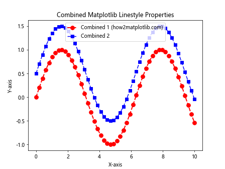
This example demonstrates how combining different linestyle properties can create visually appealing and informative plots.
Using Matplotlib Linestyle in Subplots
Matplotlib allows you to create multiple subplots within a single figure, each with its own linestyle customizations. This is particularly useful when comparing different datasets or visualizing related information side by side.
Here’s an example of using Matplotlib linestyle in subplots:
import matplotlib.pyplot as plt
import numpy as np x = np.linspace(0, 10, 100)
y1 = np.sin(x)
y2 = np.cos(x) fig, (ax1, ax2) = plt.subplots(1, 2, figsize=(12, 5))
ax1.plot(x, y1, linestyle='-', color='red', label='Sin (how2matplotlib.com)')
ax1.set_title('Sine Wave')
ax1.set_xlabel('X-axis')
ax1.set_ylabel('Y-axis')
ax1.legend()
ax2.plot(x, y2, linestyle='--', color='blue', label='Cos (how2matplotlib.com)')
ax2.set_title('Cosine Wave')
ax2.set_xlabel('X-axis')
ax2.set_ylabel('Y-axis')
ax2.legend()
plt.tight_layout()
plt.show()
Output:
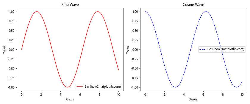
This example creates two subplots, each with its own Matplotlib linestyle customizations, allowing for easy comparison between the sine and cosine waves.
Applying Matplotlib Linestyle to Different Plot Types
Matplotlib linestyle can be applied to various plot types beyond simple line plots. Let’s explore how to use Matplotlib linestyle with different plot types:
Scatter Plots
import matplotlib.pyplot as plt
import numpy as np
x = np.random.rand(50)
y = np.random.rand(50)
plt.scatter(x, y, c='red', marker='o', s=50, label='Data points (how2matplotlib.com)')
plt.plot(x, y, linestyle='--', color='blue', alpha=0.5, label='Connecting line')
plt.title('Scatter Plot with Matplotlib Linestyle')
plt.xlabel('X-axis')
plt.ylabel('Y-axis')
plt.legend()
plt.show()
Output:
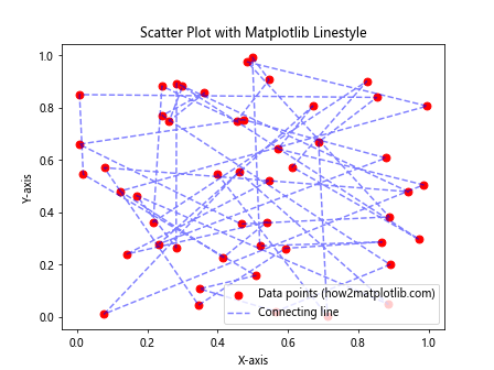
This example demonstrates how to combine a scatter plot with a connecting line using Matplotlib linestyle.
Bar Plots
import matplotlib.pyplot as plt
import numpy as np
categories = ['A', 'B', 'C', 'D', 'E']
values = np.random.randint(1, 10, 5)
plt.bar(categories, values, color='skyblue', edgecolor='black', linewidth=2, linestyle='--')
plt.title('Bar Plot with Matplotlib Linestyle')
plt.xlabel('Categories')
plt.ylabel('Values')
plt.text(0, 9, 'how2matplotlib.com', fontsize=12)
plt.show()
Output:
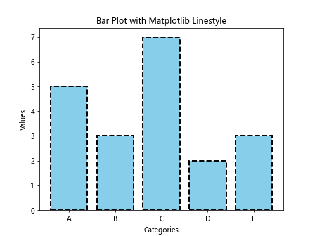
In this example, we use Matplotlib linestyle to customize the edge of the bars in a bar plot.
Pie Charts
import matplotlib.pyplot as plt
sizes = [30, 25, 20, 15, 10]
labels = ['A', 'B', 'C', 'D', 'E']
colors = ['red', 'green', 'blue', 'yellow', 'orange']
plt.pie(sizes, labels=labels, colors=colors, autopct='%1.1f%%', wedgeprops={'linewidth': 3, 'edgecolor': 'white'})
plt.title('Pie Chart with Matplotlib Linestyle')
plt.text(-1.3, 1.3, 'how2matplotlib.com', fontsize=12)
plt.axis('equal')
plt.show()
Output:
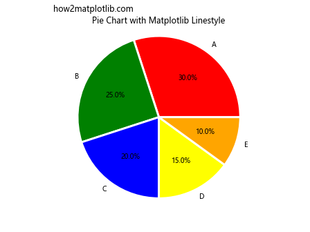
This example shows how to use Matplotlib linestyle to add edge lines to pie chart wedges.
Animating Matplotlib Linestyle
Matplotlib can be used to create animated plots with changing linestyles. This can be particularly useful for visualizing time-series data or demonstrating the evolution of a system over time.
Here’s an example of animating Matplotlib linestyle:
import matplotlib.pyplot as plt
import matplotlib.animation as animation
import numpy as np fig, ax = plt.subplots()
x = np.linspace(0, 2*np.pi, 100)
line, = ax.plot(x, np.sin(x), linestyle='-')
def animate(i):
    line.set_ydata(np.sin(x + i/10))
    line.set_linestyle(['--', ':', '-.', '-'][i % 4])
    return line,
ani = animation.FuncAnimation(fig, animate, frames=200, interval=50, blit=True)
plt.title('Animated Matplotlib Linestyle')
plt.text(0, 1.1, 'how2matplotlib.com', fontsize=12)
plt.show()
Output:
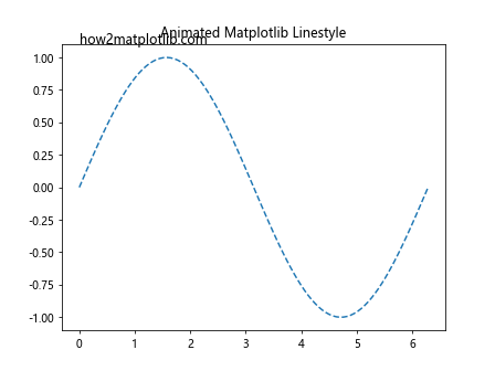
This example creates an animation where both the sine wave and the linestyle change over time.
Best Practices for Using Matplotlib Linestyle
When working with Matplotlib linestyle, it’s important to follow some best practices to ensure your visualizations are effective and easy to understand:
- Use consistent linestyles: When creating multiple plots or comparing different datasets, use consistent linestyles to represent similar types of data.
- Choose appropriate colors: Select colors that are easily distinguishable and consider color-blind friendly palettes.
- Avoid clutter: Don’t use too many different linestyles in a single plot, as it can become confusing and hard to read.
- Use line width effectively: Adjust line width to emphasize important data or create a visual hierarchy.
- Combine linestyles with markers: Use markers in conjunction with linestyles to highlight specific data points or intervals.
- Label your plots: Always include clear labels, titles, and legends to explain what each linestyle represents.
- Consider the context: Choose linestyles that are appropriate for the type of data you’re visualizing and the message you want to convey.
Here’s an example that demonstrates some of these best practices:
import matplotlib.pyplot as plt
import numpy as np
x = np.linspace(0, 10, 100)
y1 = np.sin(x)
y2 = np.cos(x)
y3 = np.tan(x)
plt.figure(figsize=(10, 6))
plt.plot(x, y1, linestyle='-', color='blue', linewidth=2, label='Sin (how2matplotlib.com)')
plt.plot(x, y2, linestyle='--', color='red', linewidth=2, label='Cos')
plt.plot(x, y3, linestyle=':', color='green', linewidth=2, label='Tan')
plt.title('Trigonometric Functions')
plt.xlabel('X-axis')
plt.ylabel('Y-axis')
plt.legend()
plt.grid(True, linestyle='--', alpha=0.7)
plt.show()
Output:
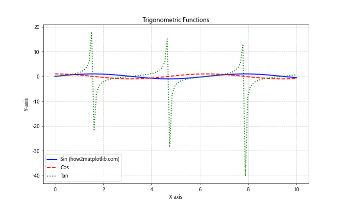
This example demonstrates the use of consistent linestyles, appropriate colors, and clear labeling to create an effective visualization.
Troubleshooting Common Matplotlib Linestyle Issues
When working with Matplotlib linestyle, you may encounter some common issues. Here are a few problems and their solutions:
- Linestyle not appearing:
- Ensure that you’re using the correct syntax for specifying linestyle.
- Check if the line is visible within the plot range.
- Inconsistent line appearance:
- Make sure you’re using the same linestyle specification consistently.
- Check for any overriding style settings in your code.
- Markers not showing:
- Verify that you’ve specified both linestyle and marker style.
- Ensure that the number of data points is appropriate for the chosen marker frequency.
- Custom linestyle not working:
- Double-check the syntax for custom linestyle patterns.
- Ensure that the on/off ink specifications are valid.
Here’s an example that demonstrates how to address some of these issues:
import matplotlib.pyplot as plt
import numpy as np
x = np.linspace(0, 10, 20)
y = np.sin(x)
plt.figure(figsize=(10, 6))
# Correct linestyle specification
plt.plot(x, y, linestyle='--', label='Dashed (how2matplotlib.com)')
# Correct marker specification
plt.plot(x, y + 0.5, linestyle='-', marker='o', label='With markers')
# Correct custom linestyle
plt.plot(x, y - 0.5, linestyle=(0, (5, 2)), label='Custom pattern')
plt.title('Addressing Common Matplotlib Linestyle Issues')
plt.xlabel('X-axis')
plt.ylabel('Y-axis')
plt.legend()
plt.show()
Output:
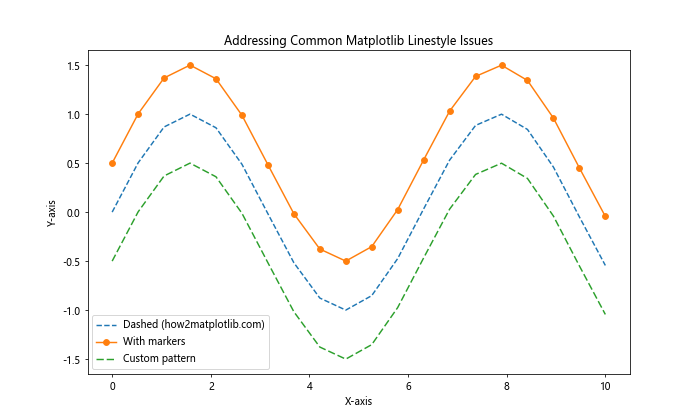
This example demonstrates the correct usage of different linestyle specifications, addressing common issues that users might encounter.
Advanced Matplotlib Linestyle Techniques
For more advanced users, Matplotlib offers additional techniques to further customize linestyles and create more complex visualizations.
Using LineCollection for Variable Linestyles
LineCollection allows you to create a collection of lines with varying properties, including linestyle, color, and width.
import matplotlib.pyplot as plt
import numpy as np
from matplotlib.collections import LineCollection x = np.linspace(0, 10, 100)
y = np.sin(x) points = np.array([x, y]).T.reshape(-1, 1, 2)
segments = np.concatenate([points[:-1], points[1:]], axis=1) lc = LineCollection(segments, linestyles=['solid', 'dashed', 'dotted', 'dashdot'], colors=['red', 'green', 'blue', 'orange'], linewidths=2) fig, ax = plt.subplots()
ax.add_collection(lc)
ax.autoscale()
ax.margins(0.1)
plt.title('Variable Linestyles with LineCollection')
plt.text(0, 1.1, 'how2matplotlib.com', fontsize=12)
plt.show()
Output:
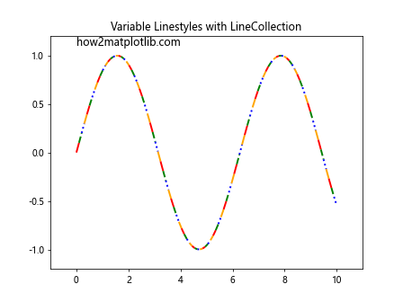
This example demonstrates how to use LineCollection to create a single line with varying linestyles and colors.
Creating Custom Dash Patterns
You can create highly customized dash patterns using arrays of on/off ink lengths.
import matplotlib.pyplot as plt
import numpy as np
x = np.linspace(0, 10, 100)
y = np.sin(x)
custom_dash_1 = (0, (5, 1, 1, 1, 1, 1))
custom_dash_2 = (0, (3, 1, 1, 1, 1, 1))
plt.plot(x, y, linestyle=custom_dash_1, linewidth=2, label='Custom Dash 1 (how2matplotlib.com)')
plt.plot(x, y + 0.5, linestyle=custom_dash_2, linewidth=2, label='Custom Dash 2')
plt.title('Custom Dash Patterns in Matplotlib')
plt.xlabel('X-axis')
plt.ylabel('Y-axis')
plt.legend()
plt.show()
Output:
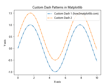
This example shows how to create and use custom dash patterns for more unique linestyles.
Matplotlib Linestyle in 3D Plots
Matplotlib linestyle can also be applied to 3D plots, allowing for even more complex and informative visualizations.
import matplotlib.pyplot as plt
import numpy as np
from mpl_toolkits.mplot3d import Axes3D
fig = plt.figure()
ax = fig.add_subplot(111, projection='3d')
t = np.linspace(0, 10, 100)
x = np.sin(t)
y = np.cos(t)
z = t
ax.plot(x, y, z, linestyle='--', color='red', linewidth=2, label='3D Curve (how2matplotlib.com)')
ax.set_xlabel('X-axis')
ax.set_ylabel('Y-axis')
ax.set_zlabel('Z-axis')
ax.legend()
plt.title('Matplotlib Linestyle in 3D Plot')
plt.show()
Output:
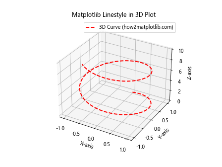
This example demonstrates how to apply Matplotlib linestyle to a 3D plot, creating a visually appealing representation of a 3D curve.
Combining Matplotlib Linestyle with Other Visualization Libraries
While Matplotlib is powerful on its own, it can also be combined with other visualization libraries to create even more sophisticated graphics. Here’s an example of how to use Matplotlib linestyle in conjunction with Seaborn, a statistical data visualization library built on top of Matplotlib:
import matplotlib.pyplot as plt
import seaborn as sns
import numpy as np
sns.set_style("whitegrid")
x = np.linspace(0, 10, 100)
y1 = np.sin(x)
y2 = np.cos(x)
plt.plot(x, y1, linestyle='--', color='blue', linewidth=2, label='Sin (how2matplotlib.com)')
plt.plot(x, y2, linestyle=':', color='red', linewidth=2, label='Cos')
sns.despine()
plt.title('Matplotlib Linestyle with Seaborn Styling')
plt.xlabel('X-axis')
plt.ylabel('Y-axis')
plt.legend()
plt.show()
Output:
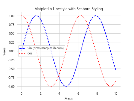
This example shows how Seaborn’s styling can be applied to a plot while still utilizing Matplotlib’s linestyle capabilities.
Matplotlib Linestyle in Real-World Applications
Understanding how to use Matplotlib linestyle effectively can be crucial in various real-world applications. Let’s explore a few examples:
Financial Data Visualization
import matplotlib.pyplot as plt
import numpy as np
dates = np.arange('2023-01-01', '2023-12-31', dtype='datetime64[D]')
prices = 100 + np.cumsum(np.random.randn(len(dates)) * 0.5)
plt.figure(figsize=(12, 6))
plt.plot(dates, prices, linestyle='-', color='blue', linewidth=2)
plt.fill_between(dates, prices, min(prices), alpha=0.1)
plt.title('Stock Price Trend')
plt.xlabel('Date')
plt.ylabel('Price')
plt.text(dates[0], max(prices), 'how2matplotlib.com', fontsize=12)
plt.grid(True, linestyle='--', alpha=0.7)
plt.show()
Output:
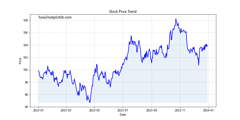
This example demonstrates how Matplotlib linestyle can be used to visualize stock price trends, a common application in financial analysis.
Scientific Data Representation
import matplotlib.pyplot as plt
import numpy as np
x = np.linspace(0, 10, 100)
y1 = np.exp(-x/10) * np.sin(x)
y2 = np.exp(-x/10) * np.cos(x)
plt.figure(figsize=(10, 6))
plt.plot(x, y1, linestyle='-', color='blue', label='Damped Sin (how2matplotlib.com)')
plt.plot(x, y2, linestyle='--', color='red', label='Damped Cos')
plt.title('Damped Oscillations')
plt.xlabel('Time')
plt.ylabel('Amplitude')
plt.legend()
plt.grid(True, linestyle=':', alpha=0.7)
plt.show()
Output:
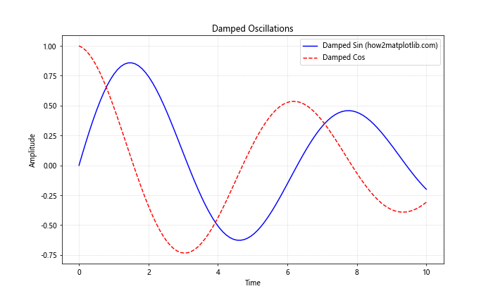
This example shows how Matplotlib linestyle can be used to represent scientific data, such as damped oscillations in physics.
Matplotlib linestyle Conclusion
Matplotlib linestyle is a powerful tool for creating informative and visually appealing data visualizations. By mastering the various aspects of Matplotlib linestyle, including line types, colors, widths, markers, and custom patterns, you can effectively communicate complex data and insights through your plots.
Throughout this comprehensive guide, we’ve explored the fundamentals of Matplotlib linestyle, delved into advanced techniques, and examined real-world applications. We’ve seen how Matplotlib linestyle can be customized to suit a wide range of visualization needs, from simple line plots to complex 3D visualizations and animated graphics.
Remember to follow best practices when using Matplotlib linestyle, such as maintaining consistency, choosing appropriate colors, and avoiding clutter. By applying these principles and the techniques discussed in this guide, you’ll be well-equipped to create professional-quality visualizations that effectively communicate your data and ideas.