A guide through the most common violations in WebAIM’s Million Report for 2023
Photo by Ayo Ogunseinde on Unsplash
Introduction
The WebAIM’s Million Report is a web accessibility test of the top million home pages. As I mentioned in my last article, the results are embarrassing.
If you want to see how your site would do, enter your URL in WebAIM’s WAVE tool.
If you make the changes listed here, you’ll have better accessibility than most of the top one million sites on the web.
Low contrast text
Time required to find a compliant color: ~ 10 seconds
Usually, an accessibility tool will detect this, but not always — especially if you’re using a gradient color or some other nonsense.
If you’re in Chrome or Edge, you can easily determine if text has a sufficient color contrast and get a suggested value if it doesn’t. NOTE: To my knowledge, Firefox doesn’t have this feature — though it will tell you that a color is not compliant.
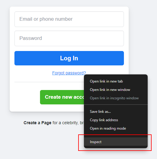
Inspect the text (Right-click over the text and click “Inspect” from the context menu). Let’s try it on the “Forgot password?” link for Facebook’s home page:

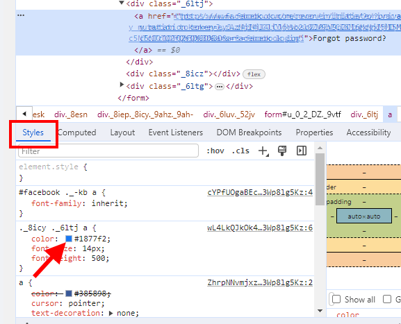
Ensure the <a> element for the “Forgot password?” link is highlighted in your Developer Tools. Look at the Styles:

Look at the top-most color style. In this case, it’s from the selector ._8icy ._6ltj a (yeah, whatever those classes mean) with a value of #1877F2.
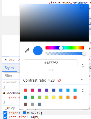
Click the blue square for the color value and you’ll see a color picker dialog:

You’ll notice that it tells you right here that the color contrast doesn’t meet the minimum 4.5:1 ratio. The text…

